- Blog
- How to Create Video Presentations That Convert
How to Create Video Presentations That Convert
Learn how to create video presentations that get results. Our guide covers scripting, AI visuals, editing, and proven tactics for maximum engagement.
Veo3 AI · 22 min read · Nov 29, 2025
Before you touch any software or even think about AI prompts, your video's success is already being decided. So many people jump straight into production, but the most powerful video presentations are built on a rock-solid foundation. It’s less about fancy animations and more about a carefully crafted story.
Quick Answer: To create video presentations, choose an AI-powered video platform suited to your workflow, provide a descriptive prompt or upload your media, configure generation settings, and export the result. Leading tools like Google Veo 3 and Runway make the process possible in minutes—no technical skills required.
This early stage is all about getting crystal clear on your purpose. If your audience only remembers one thing from your video, what should it be? That’s your core message. It's the North Star for every single decision you'll make from here on out.
Pinpoint Your Core Message
Your core message is the "why." It's the central idea that everything else in the video must support. A fuzzy goal like "showcasing a new feature" won't cut it. It’s just too vague.
Let's get specific. Instead of that, try something like: "Show busy project managers how our new automation feature can save them 5 hours a week by killing manual data entry." See the difference? Now you have a clear target. You know exactly who you're talking to (project managers), what keeps them up at night (not enough time), and the specific value you offer (saving 5 hours). Every word in your script and every image you choose should circle back to this one powerful idea.
The real secret to a memorable presentation isn't jamming in more facts. It's about being ruthless and cutting out everything that doesn't matter. You want one big idea to land perfectly, not a dozen small ones to miss the mark.
Understand Who You Are Talking To
Once you've nailed down your message, it's time to get inside your audience's head. A video for a room full of engineers will be a world apart from one meant for potential investors. You have to adapt. I always ask myself these questions before writing a single word:
- How much do they already know? You don't want to drown beginners in jargon, but you also don't want to bore experts by oversimplifying things.
- What are their biggest problems or goals? Your video needs to solve a problem for them, not just be a list of your product's features.
- What kind of tone will connect with them? Should you be formal and data-heavy, or would a more casual, story-driven approach work better?
When you speak their language, you build an instant connection. It makes them feel understood and much more open to what you have to say. This little diagram really captures how these pieces fit together.
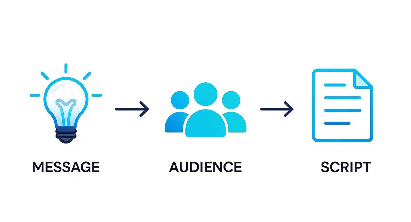
As you can see, a great script is the direct result of a clear message and a deep understanding of your audience.
Crafting a Conversational Script
Now, let's get to writing. The most common mistake I see is people writing a script that’s meant to be read, not heard. Big difference. Your script should feel like you're talking to a friend, not presenting a thesis.
Here’s my go-to trick: read every single line out loud. Does it sound clunky or unnatural? Are the sentences a mile long? If you trip over a word or phrase while reading it, you can bet your audience will struggle to follow it.
Stick to simple words and shorter sentences. Keep it conversational. For a deeper dive into this, check out our guide on content creation best practices. Getting this groundwork right is what turns a decent video into a truly persuasive one, and it makes the entire production process a whole lot smoother.
Bringing Your Script to Life with a Storyboard
You’ve got a polished script, and the temptation to dive right into creating your video is real. But hold on. Skipping the storyboard is like trying to build a house without a blueprint—you'll probably end up with something that feels disjointed and confusing.
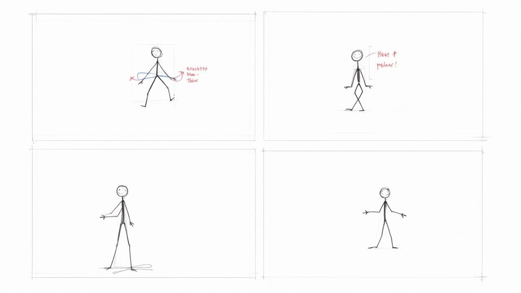
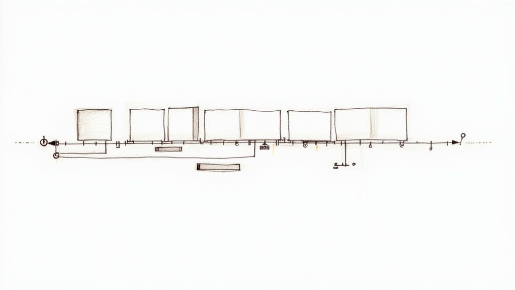
Think of your storyboard as the visual roadmap. It translates the words from your script into a concrete plan for every single shot. It’s essentially a comic book version of your video, and you absolutely don't need to be an artist. Stick figures and basic shapes do the job perfectly. The whole point is to map out the flow, spot awkward pacing, and decide what goes where before you're deep into the production process.
Breaking Down Your Script into Scenes
First things first, go through your script and break it down into individual scenes or key moments. Each one should represent a single, distinct idea or action. For each scene, you'll create a simple sketch or just a quick note that answers a few crucial questions:
- What's on screen? Describe the primary visual. Is it a speaker, a product shot, an animated chart?
- What text is visible? Jot down any headlines, bullet points, or key data that needs to be displayed.
- What’s the camera doing? Is this a tight close-up, a wide establishing shot, or something more dynamic?
This exercise forces you to think like a director. For example, a scene explaining a complex statistic isn't just a number on a screen; it becomes an animated bar graph that grows to illustrate the point. A customer testimonial feels more genuine with a close-up shot that captures their expression.
For a deeper dive, our guide on how to storyboard a video has tons of practical advice for your next project.
Planning Visuals and Shot Types
A great storyboard helps you map out the rhythm of your video. You can plan for variety to keep your viewers hooked, like switching between a "talking head" shot of the presenter and B-roll footage that actually shows what they’re talking about. It keeps things moving.
This is also the perfect time to think about animations, transitions, and on-screen graphics. By planning them now, you ensure they actually support the story instead of just being a distraction. Honestly, a simple two-column table—script on the left, visual notes on the right—is often all you need to get started.
Your storyboard is the ultimate pre-flight check. It lets you spot awkward transitions, confusing visuals, or scenes that just drag on forever. Catching these things now is a lot easier (and cheaper) than fixing them in post-production.
The demand for this kind of dynamic visual content is absolutely exploding. The global presentation software market is expected to jump from USD 8.29 billion to USD 15.76 billion by 2029. Why? Because 91% of businesses now use video as a core marketing tool, and they know that a well-planned visual story is non-negotiable for connecting with people. You can read the full research on the presentation software market to see where things are headed. This massive shift is exactly why a thoughtful storyboarding process isn't just a nice-to-have anymore—it’s essential.
Using AI to Generate Your Video Content
Once your storyboard is locked in, it's time to bring those ideas to life. This is where AI video tools really shine, transforming what was once a complex, technical headache into a genuinely creative process. You don't need a background in animation or cinematography anymore.
The real skill today is learning how to be a great director for your AI. It all boils down to how you write your prompts. A vague command will give you a vague, often generic, result. But a detailed, descriptive prompt? That's what guides the AI to create the exact scene you have in your head.
This isn't just a niche trend; it's a massive shift. The adoption of AI in presentation software jumped by 26% year-over-year in the first quarter of 2025. That’s a huge indicator of how much people want smarter creation tools. Right now, North America is leading the charge, holding 36.4% of the global market for this tech. If you want to dive deeper, you can explore the full market analysis on presentation software.
Crafting Prompts That Actually Work
To get a video that feels cohesive and professional, your prompts need to be incredibly specific. Think of it less like a search query and more like you're describing a scene to an artist over the phone. Every detail matters.
The difference between a basic prompt and an advanced one is night and day. Imagine you need a scene about teamwork. A basic prompt gets you a basic, forgettable image. But with a few more details, you can direct the AI to create something with mood, style, and focus.
Here’s a look at how to level up your instructions to the AI.
AI Video Generation Prompting Techniques
| Goal | Basic Prompt Example | Advanced Prompt Example |
|---|---|---|
| Show Teamwork | A team collaborating in an office. |
Medium shot of a diverse team of three professionals around a modern conference table. Bright, natural light streams from a large window. One person points to a laptop screen, smiling. Cinematic style, shallow depth of field, warm color palette. |
| Illustrate Growth | A plant growing. |
Time-lapse of a small green seedling sprouting from dark soil and growing into a lush plant. Macro lens perspective, soft morning light, 4K resolution, vibrant greens. |
| Depict Data Analysis | Person looking at charts. |
Over-the-shoulder shot of a data analyst pointing at a glowing holographic interface displaying complex financial charts in a dark, futuristic office. Neon blue and purple hues, high-tech aesthetic. |
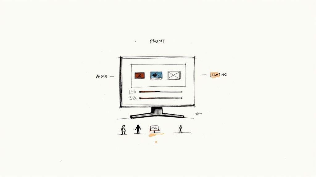
The advanced prompts give the AI specific instructions on everything from the camera angle and lighting to the mood and artistic style. This level of detail is how you get visuals that look intentional, not just randomly spat out by a machine.
Building Visual Consistency Across Scenes
One of the biggest giveaways of an AI-generated video is a lack of consistency. If one scene is a photorealistic clip and the next is a flat cartoon, it immediately feels jarring and amateurish. The secret to avoiding this is to create a simple "style guide" for your prompts.
Before you start generating, decide on the core visual elements you'll use in every single prompt. This includes things like:
- Art Style:
Minimalist line art animation,Photorealistic 8K, orWatercolor illustration style. - Color Palette:
Dominated by blues and grays with orange accents, orWarm, earthy tones. - Lighting:
Soft diffused lighting, orDramatic, high-contrast film noir lighting.
By tacking these phrases onto the end of every prompt, you're essentially training the AI on your project's unique aesthetic. This creates a unified look that makes your presentation feel polished and professional.
Pro Tip: I like to keep a "master prompt" template in a separate text file. It has all my core style parameters locked in. For each new scene, I just copy the template and add the specific action. It saves a ton of time and ensures I don't forget anything.
Selecting the Right AI Style for Your Message
The style you choose should always serve the story you're telling. An AI Video Generator tool is fantastic for speeding up creation, but picking the right output is what makes it effective. A tech startup will probably want a sleek, futuristic animated style to match its brand. On the other hand, a nonprofit sharing a personal story will get much more impact from a grounded, photorealistic approach that builds an emotional connection.
Think about what best fits your content:
- Photorealistic: Perfect for creating relatable, human-centric scenes or showing off real-world products.
- 2D/3D Animation: Fantastic for breaking down complex ideas, explaining a process, or building a memorable brand identity.
- Illustrative Styles (watercolor, sketch, etc.): Great for a softer, more artistic vibe that can set a unique mood.
Ultimately, the goal is to pick a style that aligns with what your audience expects and, most importantly, enhances your narrative. This is how you turn a powerful piece of tech into a true creative partner. For a deeper dive, check out our guide on how to create videos with AI, where we cover even more advanced techniques.
Assembling Your Presentation in the Edit
You’ve got your AI-generated clips, a crisp voiceover, and all your other assets lined up. Now for the fun part: the edit. This is where you pull everything together and transform a folder of individual files into one cohesive, compelling story. Think of the editing timeline as your canvas. The real art is stitching it all together so seamlessly that the viewer is completely absorbed in your message.
Your storyboard is your best friend here. Start by dropping your video clips onto the timeline in the sequence you originally planned. Don't get bogged down in perfecting the timing just yet; the goal is to get the basic structure in place. This is what we call a "rough cut," and it’s invaluable for seeing the overall flow and spotting any narrative gaps before you dive into the finer details.
Thankfully, modern tools have made this process incredibly intuitive. We're seeing a huge shift toward cloud-based software, and the numbers back it up. The video editing software market was valued at USD 549 million in 2024 and is on track to hit USD 1.017 billion by 2032. In fact, cloud solutions already make up about 64% of this market, which shows just how much creators value accessible, on-demand platforms that fit right into their workflow. You can discover more insights about the presentation software market to see just how fast it's growing.
Refining Your Timeline and Pacing
With your clips in order, it's time to work on the timing and pacing—and this is where the magic really happens. Pacing is the rhythm of your video. It sets the energy and, more importantly, keeps your audience hooked.
First, trim the fat. Go through each clip and cut out any dead air or unnecessary pauses at the beginning or end. If you have a clip of a chart animating, for example, time it so the key data point appears at the exact moment your voiceover mentions it. You want a tight, efficient sequence where every single second serves a purpose.
Next, think about your transitions. It's easy to get carried away with flashy wipes and dissolves, but honestly, a simple, clean cut is your most powerful tool. It keeps the viewer focused on your content. Save the more stylized transitions for moments when you need to signal a major topic change or a shift in the story.
A rookie mistake I see all the time is monotonous pacing. Mix it up! A rapid sequence of quick cuts can build excitement and energy, while letting a powerful visual linger on screen for an extra couple of seconds can add some serious emotional weight.
Mastering Your Audio Mix
Great visuals might grab attention, but it’s the audio that makes a video feel truly professional. Nothing will make a viewer click away faster than bad sound. Your number one priority has to be making sure your voiceover is clear, crisp, and at a consistent volume throughout.
Once your narration is solid, layer in your background music. The key word here is subtlety. Music should support the mood, not fight your voice for attention. A great rule of thumb is to set your music volume so low you can barely hear it, then nudge it up just a tiny bit.
Here are a few audio tricks I swear by:
- Use Audio Ducking: Most modern editing software has an "auto-ducking" feature. It’s a lifesaver. It automatically lowers the music volume whenever you’re speaking, then brings it back up.
- Add Sound Effects (SFX): Don't underestimate the power of subtle sound design. A soft "swoosh" when a text overlay appears or a gentle "click" can make your presentation feel incredibly dynamic and polished.
- Do a Final Mix Check: Before you export, listen to the entire video with a good pair of headphones. This is your chance to catch any weird volume spikes or imperfections. You want to make sure your viewer isn't constantly adjusting their volume.
Applying Basic Color Correction
The final layer of polish is color. Even AI-generated clips created from the same prompt can have slight variations in brightness or tone. The goal of color correction isn't to be the next Christopher Nolan; it's simply to create visual consistency across your entire video.
You don't need fancy tools. Most editing programs have basic color controls that let you adjust:
- Exposure: This is the overall brightness or darkness of a clip. Use it to match the light levels from one shot to the next.
- Contrast: This adjusts the difference between the light and dark parts of the image. A little boost in contrast can make your visuals really pop.
- Saturation: This controls how intense the colors are. Be gentle here—cranking the saturation too high can make your video look cheap and unnatural.
By applying a consistent color treatment to all your clips, you tie everything together. It's this final step that gives your presentation a professional, high-quality finish that builds credibility and keeps your audience focused on your message.
Final Touches for Engagement and Accessibility
Your video is rendered, the audio is locked in, and the narrative flows just right. You might think you're at the finish line, but there's one more crucial phase. These final polishes are what elevate a good video into a great one, turning it from a simple broadcast into content that genuinely connects with everyone in your audience.
This isn't just about making it look pretty. It's about maximizing engagement and ensuring your message is crystal clear to everyone, no matter how they’re watching. A truly professional video presentation isn't just seen; it's understood, felt, and remembered.
Making Your Content Accessible to All
Thinking about accessibility isn't just about ticking a box—it's one of the smartest things you can do to broaden your reach. When you design a video that works for everyone, you automatically make it better for all viewers.
The single most important step is adding accurate, synchronized captions. This is about more than just serving viewers with hearing impairments. Think about how many people scroll through social media in a silent office or on public transit. Without captions, your message is completely lost on them.
A word of caution: don't just set and forget auto-generated captions. While the tech has come a long way, it still stumbles over industry jargon, brand names, or complex terms. A quick manual proofread is a non-negotiable step for maintaining a professional look.
Beyond captions, take a hard look at your visuals. Is the text on screen actually easy to read? You'll want to stick with high-contrast color combinations (like dark text on a light background) and choose clean, legible fonts. This isn't the place for an overly ornate script font, especially when layered over a busy background.
Techniques for Holding Viewer Attention
An accessible video that’s boring is still, well, boring. Keeping your audience hooked from the first second to the last requires a few deliberate moves in your final edit. The goal is simple: break up the monotony and keep their brains from wandering.
One of my favorite tricks for this is the pattern interrupt. It's any unexpected change that snaps the viewer out of a predictable rhythm.
Here are a few easy-to-implement pattern interrupts:
- Switch the Camera Angle: If you’re showing a speaker, don't just leave them in a static shot. Cut to a different angle or punch in for a close-up when they make a key point.
- Bring in On-Screen Graphics: Use animated text, icons, or charts to highlight important numbers or ideas. It gives the eyes something new to focus on.
- Add Subtle Sound Effects: A well-placed swoosh or click can draw attention to a new element appearing on screen, reinforcing the visual change.
Pacing is another huge factor. A video that drones on at a single speed is a recipe for tune-out. You need to vary the rhythm. Build excitement with quick cuts and upbeat music in the intro, then slow things down with longer shots and ambient sound when you need to let a powerful idea sink in.
Final Review and Pre-Launch Checklist
Before that video goes live, you absolutely have to run a final quality control check. I always recommend watching the entire thing as if you're seeing it for the first time. You’ll be surprised by the small mistakes you catch with fresh eyes.
Here’s a quick checklist I run through every single time:
- Typo Hunt: Proofread every single piece of text on screen—titles, lower thirds, call-to-action buttons, everything.
- Audio Level Check: The best way to do this is with headphones. Listen for any jarring jumps in volume between your voice, the background music, and any sound effects.
- Caption Sanity Check: Read through your captions one last time to make sure they’re perfectly timed and free of any glaring errors from the auto-generator.
- Multi-Device Preview: Watch your video on a phone, a tablet, and a desktop computer. Is the text still readable on the small screen? Do the colors look right everywhere?
Investing a little extra time in these final steps ensures all your hard work pays off. By layering in smart accessibility and engagement tactics, you create a video that doesn't just talk at people—it leaves a real, lasting impression.
Common Questions About Video Presentations
<iframe width="100%" style="aspect-ratio: 16 / 9;" src="https://www.youtube.com/embed/akefs4zn9I4" frameborder="0" allow="autoplay; encrypted-media" allowfullscreen></iframe>
As you start making video presentations, you're bound to run into a few common questions. It's just part of the process. Knowing the answers to these frequent hurdles ahead of time can make everything feel a lot smoother.
This section is designed to tackle those "what if" and "how do I" moments head-on. We'll get into everything from how long your video should be to making sure your AI-generated content doesn't feel like it came from a robot. Think of it as a quick reference guide to help you refine your workflow and create with confidence.
What Is the Ideal Length for a Video Presentation?
There’s no magic number here—it all comes down to where your audience is watching and what they expect. The platform you're publishing on is the single biggest factor. A video that’s perfect for one channel can completely miss the mark on another.
For internal communications, like employee training or deep-dive webinars, you have a captive audience that's there to learn. In those cases, a longer format of 15-30 minutes can be perfectly fine. But when you’re creating marketing content for a social feed or a landing page, you’re fighting for every second of attention. Keep it short and sweet—aim for 2-5 minutes before they scroll on.
The golden rule? Be as brief as possible without gutting your core message. Dive into your platform's analytics. The viewer drop-off data is pure gold—it shows you the exact moment you start losing people, so you can tighten things up next time.
How Can I Make My AI-Generated Video Look Less Generic?
The secret to avoiding that cookie-cutter "AI look" is to think like an art director, not just a prompter. Specificity is your best friend. Vague prompts give you bland, forgettable visuals. Don't just ask for "a person giving a presentation." Get granular.
Try something much more descriptive, like: “A female professional in her 30s, wearing a navy blue blazer, presenting in a modern, sunlit office with a minimalist aesthetic, cinematic lighting, shallow depth of field.” See the difference? That level of detail gives the AI a clear scene to build, complete with a specific mood and style.
To really make it your own, establish visual consistency across all your clips by using similar style parameters in your prompts. Then, bring everything into your editing software for the final human touch.
- Custom Graphics: Overlay your logo, branded lower-thirds, or unique title cards.
- Consistent Color Grade: Apply the same color correction across all clips for a polished, cohesive feel.
- Personalized Audio: Nothing makes a video feel more authentic than your own voiceover and carefully chosen music.
When you blend distinct AI-generated scenes with your own post-production polish, you create something that feels entirely unique to your brand.
Do I Need Expensive Software to Create a Professional Video Presentation?
Not anymore. While high-end tools like Adobe Premiere Pro are incredibly powerful, the barrier to entry for creating professional video has plummeted. Today, there are amazing tools available for any budget.
Cloud-based editors like Clipchamp or Descript offer fantastic features without the hefty price tag. More importantly, AI video generators can handle the heavy lifting of creating the visuals. When it comes to editing, free software like DaVinci Resolve gives you access to tools that were once exclusive to Hollywood studios.
At the end of the day, the quality of your video has less to do with how much you spent on software and more to do with your grasp of the fundamentals. Great storytelling, solid pacing, and crystal-clear audio will always have a bigger impact than the program you used to piece it all together.
What Are the Most Common Mistakes to Avoid?
Knowing the common pitfalls is half the battle. I see a lot of creators, especially when they're starting out, make a few of the same mistakes that can really weaken their message.
The biggest—and most unforgivable—error is poor audio quality. If your voiceover is muffled, full of background noise, or has inconsistent volume, people will click away in a heartbeat. Another classic mistake is creating on-screen "walls of text" that no one has the time or patience to read.
Here are a few other missteps to watch out for:
- Inconsistent Visuals: Jumping between clashing styles without a clear, artistic reason.
- A Rambling Narrative: This almost always happens when you skip the script and storyboard phase.
- No Clear Call to Action: You've got their attention—now what do you want them to do?
Avoiding these is all about planning. A solid script and a clear visual strategy will help you sidestep these common issues and produce something truly effective.
Ready to stop planning and start creating? With Veo3 AI, you can transform your ideas into stunning videos in minutes. Just type a prompt, choose a style, and watch our advanced AI bring your vision to life—no complex software required. Start creating for free with Veo3 AI.
Our Verdict
Learning how to create video presentations has never been more accessible thanks to today's AI-powered tools. We recommend starting with one of the beginner-friendly platforms mentioned in this guide, following the step-by-step process outlined above, and experimenting with different settings to find your preferred style. The investment of time to master this skill will pay off in consistently high-quality content.
Related Articles
Continue with more blog posts in the same locale.
Veo 3 Free Unlimited Access: How to Get the Most Generations Without Paying
Complete guide to getting free Veo 3 access in 2026. AI Studio quota, Google One trial, tips to maximize free generations.
Read article
What is Google Veo 4?
Complete overview of Google Veo 4 AI video generator features, capabilities, and improvements over Veo 3.
Read article
Veo 3 Lite Review 2026: Is Google's Free Tier Worth Using?
Honest review of Google Veo 3 Lite. Capabilities, limitations, comparison with full Veo 3 and alternatives like Seedance 2.0. Who should and should not use it.
Read article