How to Get a Cinematic Film Look with Veo 3: Color Grading & LUT-Style Prompts (2026)
Get a real cinematic film look in Veo 3 by treating color grading as a prompting problem: film-stock emulation, LUT-style looks, contrast curves, and a copy-paste grading prompt library.
Emma Chen · 15 min read · Jun 26, 2026
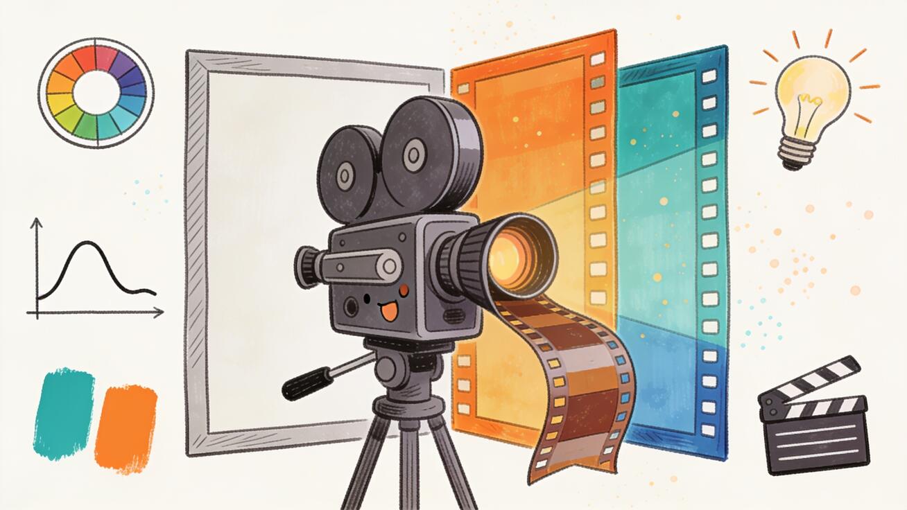
Most people who try Veo 3 for the first time describe the same disappointment: the motion is good, the realism is impressive, but the footage still looks digital. It looks like a high-end phone clip, not a frame from a film. The gap between "AI video" and "cinema" is almost never about resolution or motion — it is about color. Film stocks, contrast curves, color separation, halation, and grain are the invisible language of the movie look, and Veo 3 understands that language fluently if you know how to speak it.
This guide is a focused, practical workflow for getting a genuine cinematic film look with Veo 3 by treating color grading as a prompting problem rather than a post-production one. Because Veo 3 bakes its grade into the generation, the place to control your film look is inside the prompt — using LUT-style descriptors, film-stock emulation, and lighting language that the model already associates with professional cinematography. By the end you will have a repeatable recipe, a library of copy-paste grading prompts, and a QA checklist to keep an entire sequence consistent.
Quick answer: To get a cinematic film look in Veo 3, describe the grade explicitly in your prompt — name a film stock or LUT style (e.g. "Kodak Portra 400 emulation," "teal-and-orange blockbuster grade"), specify contrast and color separation ("lifted shadows, rolled-off highlights, warm skin tones"), and lock the lighting and lens ("soft key, 35mm anamorphic, shallow depth of field, subtle halation"). Veo 3 renders the look at generation time, so the prompt is your color grade.
Why Veo 3 Footage Looks "Digital" by Default
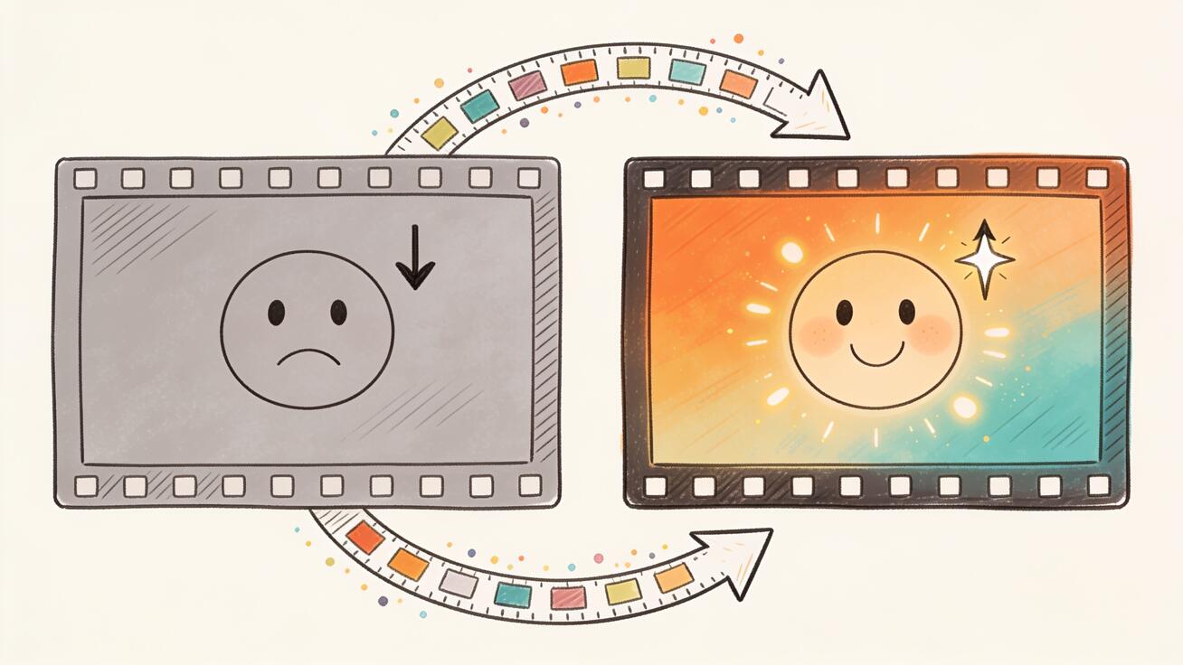
When you give Veo 3 a plain prompt like "a man walking down a city street at night," the model fills in the most statistically average rendering: neutral white balance, high mid-tone contrast, saturated colors, sharp edges, and a clean digital gamma. That output is technically correct and visually flat. Real cinema almost never looks like that.
Film — and the digital cinema cameras that emulate it — has a set of signatures the eye reads instantly as "movie":
- Rolled-off highlights. Bright areas don't clip to harsh white; they compress gently into a soft shoulder.
- Lifted, colored shadows. Blacks are rarely pure black. They're slightly raised and tinted (often cool blue or warm brown).
- Color separation, not saturation. Cinematic images push complementary colors apart (warm skin vs. cool background) rather than cranking every color up.
- Controlled grain and texture. A fine, organic grain structure breaks up the clinical smoothness of digital sensors.
- Halation and bloom. Light sources glow slightly and bleed a warm halo into surrounding areas.
- A consistent "stock." Every shot in a film shares the same color DNA, which is what makes a sequence feel intentional.
Veo 3 can reproduce every one of these signatures — but only if you ask for them. The default prompt asks for none of them, so you get the average. The rest of this guide is about replacing "average" with a deliberate grade.
The Core Recipe: Five Layers of a Film Look
Think of a cinematic prompt as five stacked layers. You don't need all five in every prompt, but the more you specify, the more "graded" the result feels. Always describe them in this order, because it mirrors how a cinematographer and colorist actually build an image.
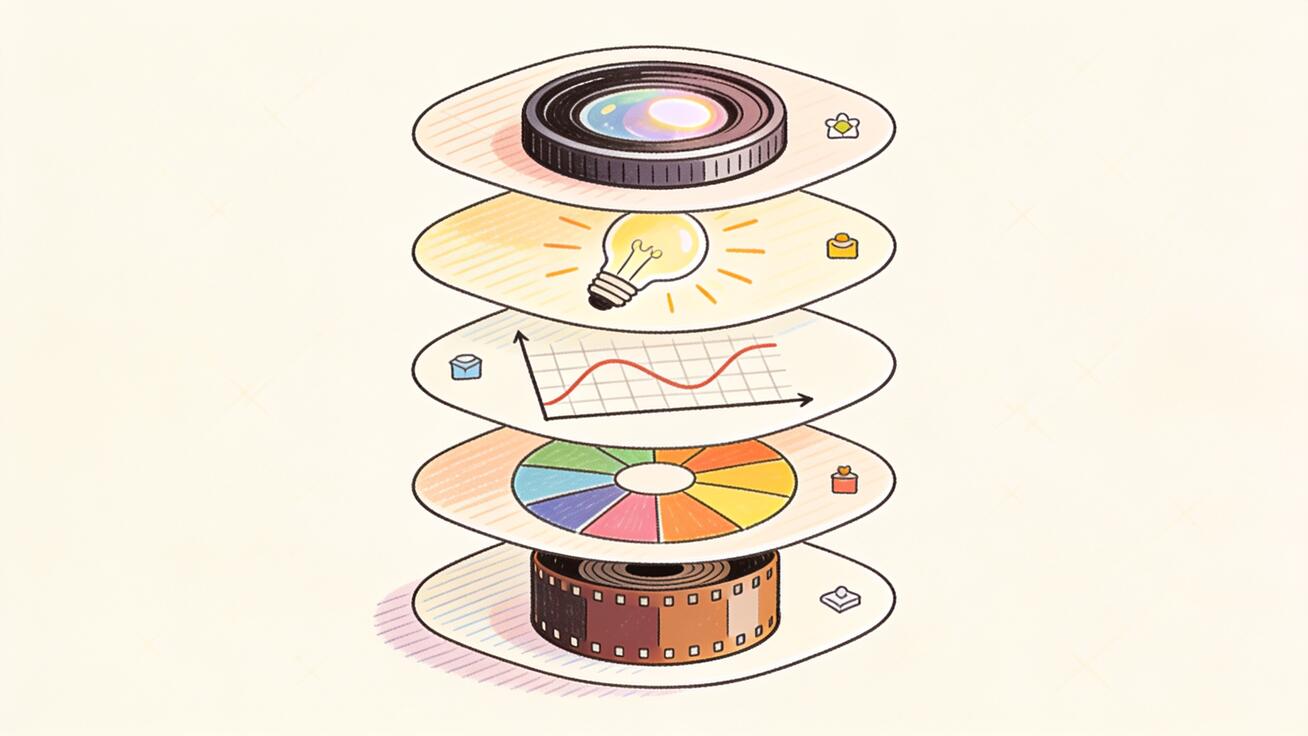
Layer 1 — The Stock or LUT Reference
This is the single most powerful lever. Naming a film stock or a recognizable LUT style instantly pulls Veo 3 toward a coherent color identity.
Useful references that Veo 3 responds to:
- "Kodak Portra 400 emulation" — warm, gentle, flattering skin tones, soft contrast. Great for portraits and intimate drama.
- "Kodak Vision3 500T film stock" — the modern motion-picture negative look: clean but organic, holds highlights, slightly cool shadows.
- "Fujifilm Eterna look" — muted, desaturated, low-contrast, very "indie cinema."
- "CineStill 800T, tungsten-balanced, visible halation around lights" — the moody neon-night aesthetic.
- "Technicolor three-strip emulation" — punchy, saturated reds and cyans, vintage Hollywood.
- "Bleach bypass process, silver retention, desaturated with crushed contrast" — gritty war-film / thriller look.
Layer 2 — The Color Grade / Tonal Relationship
Describe the relationship between colors and tones, not just hue. This is where "teal and orange" and similar LUT-style language lives.
- "Teal-and-orange blockbuster grade: warm orange skin tones, deep teal shadows."
- "Cross-processed look: green-shifted shadows, yellow highlights."
- "Monochromatic warm amber grade, sepia-leaning."
- "Cool desaturated grade with a single warm practical light as the only saturated element."
- "Day-for-night grade: underexposed, blue-shifted, moonlit."
Layer 3 — Contrast and Dynamic Range
Tell Veo 3 how to shape the tone curve. This is what separates flat from filmic.
- "Lifted shadows, rolled-off highlights, low overall contrast (filmic log-style curve)."
- "High-contrast chiaroscuro with deep crushed blacks."
- "Soft, milky low-contrast haze, faded blacks."
Layer 4 — Lighting Design
The grade only works if the light underneath it is shaped. Specify the key, the mood, and the practicals.
- "Soft single key light from a large window, deep falloff into shadow (Rembrandt lighting)."
- "Low-key, motivated by a single warm practical lamp; the rest of the room in shadow."
- "Golden-hour backlight, lens flare, atmospheric haze catching the light."
- "Overcast soft top light, even and naturalistic."
Layer 5 — Lens, Texture, and Optics
Finally, the optical character that sells the format.
- "Shot on 35mm anamorphic, shallow depth of field, oval bokeh, subtle horizontal lens flares."
- "Vintage spherical prime, gentle edge softness, slight chromatic aberration."
- "Fine 35mm film grain, subtle gate weave, organic halation around highlights."
Stack these and you get a prompt that is no longer asking for "a video" — it's asking for a graded frame.
Building Your First Graded Prompt, Step by Step
Let's turn a flat idea into a cinematic one in real time.
Flat starting prompt:
"A woman sitting at a cafe table by a window, drinking coffee."
Step 1 — add the stock (Layer 1):
"...Kodak Portra 400 emulation, warm flattering skin tones."
Step 2 — add the grade (Layer 2):
"...gentle warm-amber grade, cool soft shadows for separation."
Step 3 — add contrast (Layer 3):
"...low-contrast filmic curve, lifted shadows, softly rolled-off window highlights."
Step 4 — add lighting (Layer 4):
"...soft directional key from the large window, Rembrandt falloff, the background of the cafe dropping into gentle shadow."
Step 5 — add optics (Layer 5):
"...shot on 35mm anamorphic, shallow depth of field, oval bokeh from background lights, fine film grain, subtle halation."
Final assembled prompt:
"A woman sitting at a cafe table by a window, drinking coffee, looking out thoughtfully. Kodak Portra 400 emulation with warm flattering skin tones, gentle warm-amber grade, cool soft shadows for color separation. Low-contrast filmic curve with lifted shadows and softly rolled-off window highlights. Soft directional key light from the large window with Rembrandt falloff, the cafe background dropping into gentle shadow. Shot on 35mm anamorphic with shallow depth of field, oval bokeh from background lights, fine film grain, and subtle halation around the brightest highlights. Calm, intimate, slow-cinema mood."
That single prompt now contains an entire colorist's intent. The output will read as a frame from a film rather than a stock-video clip.
A Copy-Paste Library of LUT-Style Grading Prompts
Drop these grading blocks at the end of any subject description. Each is a self-contained "look" you can reuse across a project for consistency.
1. Blockbuster Teal & Orange
"Teal-and-orange cinema grade: warm orange skin tones against deep teal-blue shadows, high but smooth contrast, rolled-off highlights, anamorphic 35mm, subtle blue lens flare, fine grain."
2. Warm Nostalgic Super-8
"Vintage Super-8 home-movie look: warm faded amber grade, lifted milky blacks, low saturation, heavy grain, slight gate weave, soft vignetting, golden afternoon light."
3. Moody Neon Noir (CineStill)
"CineStill 800T tungsten night look: cool blue base with saturated magenta and cyan neon practicals, strong red halation glowing around every light source, crushed shadows, wet reflective streets, 35mm grain."
4. Bleach-Bypass Thriller
"Bleach-bypass grade: desaturated, silver-retained, high contrast with crushed inky blacks and harsh metallic highlights, cold steel-blue cast, gritty texture, hard top light."
5. Soft Indie Drama (Eterna)
"Fujifilm Eterna emulation: muted low-contrast pastel grade, gentle desaturated greens, soft natural window light, lifted shadows, delicate skin tones, minimal grain, naturalistic and understated."
6. Golden-Hour Romance
"Warm golden-hour grade: honey-amber highlights, long backlit lens flares, atmospheric haze, soft glowing skin, low contrast, Portra-style warmth, 35mm shallow depth of field, dreamy bloom."
7. Sci-Fi Cool & Clinical
"Cool clinical sci-fi grade: desaturated steel-blue and cyan palette, single warm practical accent, clean high-key fill with controlled contrast, sharp anamorphic optics, faint blue halation."
8. Day-for-Night
"Day-for-night grade: underexposed two stops, deep blue moonlit cast, cool shadows, a single warm window or streetlamp as the only warm source, soft contrast, subtle grain."
9. Western / Desert Epic
"Sun-baked Western grade: warm dusty ochre and teal sky separation, high overhead sun, hard shadows, slightly faded blacks, fine grain, wide anamorphic vista, heat haze."
10. Black & White Cinema
"High-contrast black-and-white film: rich tonal range, deep blacks with detail, glowing highlights, dramatic side key light, 35mm grain, classic noir chiaroscuro, no color."
Each of these is intentionally a style, not a scene — so you can pair any one with any subject and get a consistent look.
Keeping a Whole Sequence Consistent
A single beautiful shot is easy. The real test of a film look is making ten shots feel like they belong to the same movie. Since Veo 3 generates each clip independently, you have to enforce consistency yourself.
1. Lock a "master grade" string. Write your chosen grading block once and paste the exact same text into every prompt in the sequence. Even small wording changes ("warm grade" vs. "warm-amber grade") nudge the output. Treat the grade like a LUT you apply to every clip.
2. Fix your time of day and light direction. "Golden-hour backlight from camera left" must stay constant across cuts, or the eye will catch the mismatch immediately.
3. Hold the optics constant. Keep "35mm anamorphic, shallow depth of field, fine grain" identical. Switching lens language mid-sequence reads as a different camera.
4. Describe the same color palette. If your world is "teal shadows, warm practicals," repeat those exact color anchors. Name the dominant and accent colors every time.
5. Generate variations and select for match. Produce 2–3 takes per shot and choose the ones whose grade lines up best, rather than accepting the first render. Matching beats perfection.
A practical trick: keep a small text file with your master grade block, your lighting block, and your optics block. Build every prompt as [unique action] + [master grade] + [lighting] + [optics]. The first part changes per shot; the last three never do.
White Balance Is Part of the Grade
One overlooked lever is white balance. Cinema rarely uses perfectly neutral white balance — it deliberately leans warm or cool to set emotional temperature, and Veo 3 responds strongly to white-balance language inside a prompt.
- Warm bias ("tungsten-warm white balance, amber cast") feels intimate, nostalgic, safe — think kitchens, golden hour, memory.
- Cool bias ("cool daylight-shifted white balance, blue cast") feels lonely, tense, clinical — think night exteriors, hospitals, sci-fi interiors.
- Mixed white balance ("warm practical lamps against cool blue window light") is the single most "cinematic" lighting cliché there is, because it creates instant color separation between foreground and background. Naming it explicitly is one of the fastest ways to make a flat interior look graded.
A reliable pattern: pick one dominant temperature for the overall scene, then introduce a single opposing accent. "Cool blue night street, one warm sodium streetlamp." That deliberate tension is what your eye reads as a colorist's hand.
Anamorphic vs. Spherical: Choosing Your Optical Signature
The lens language in Layer 5 changes the feel more than people expect. Anamorphic ("35mm anamorphic, oval bokeh, horizontal flares, mild edge distortion") reads as big-budget, widescreen, and modern blockbuster. Spherical vintage primes ("vintage spherical prime, soft edges, gentle chromatic aberration, round bokeh") read as intimate, classic, and character-driven. Pick one and keep it locked for the whole project — mixing the two inside a single sequence is one of the subtle reasons cuts feel "off" even when the grade matches.
Real Use Cases
Short films and narrative. A consistent stock emulation (say, Vision3 500T) across every scene gives a no-budget short the production value of a graded feature. Use day-for-night for exteriors and low-key practicals for interiors, all under the same master grade.
Music videos. This is where bold LUT-style looks shine. Switch between the neon-noir and bleach-bypass blocks for different sections, but keep the optics constant so the cuts feel deliberate rather than accidental.
Commercials and product films. Brands want a clean but premium look. The golden-hour and soft-indie blocks flatter products and people without looking cheap. Add "soft glowing rim light on the product" to your subject line.
Movie-trailer-style content. Stack high-contrast teal-and-orange with anamorphic flares and crushed blacks. Pair it with slow push-ins and you get instantly recognizable trailer grammar.
Mood boards and pre-visualization. Even if you'll shoot the real thing on a camera, Veo 3's grading prompts let you preview a look — "what does this scene feel like in bleach-bypass vs. Portra?" — before committing a crew.
Prompt Patterns That Quietly Ruin the Look
A few common mistakes flatten an otherwise good grade:
- Over-saturating. "Vibrant, vivid, highly saturated colors" pulls Veo 3 toward the digital look you're trying to escape. Ask for separation, not saturation.
- Asking for "HDR" or "ultra-realistic." These tend to maximize contrast and clarity — the opposite of a filmic curve. Prefer "filmic," "soft contrast," "rolled-off highlights."
- Stacking contradictory stocks. "Portra 400 and bleach-bypass and Technicolor" confuses the model. Pick one stock identity per shot.
- Forgetting the light. A grade with no described lighting falls back to flat ambient light, and no LUT can save flat light.
- Changing the grade wording between shots. As above — inconsistent phrasing is the number-one cause of mismatched sequences.
Quality-Control Checklist Before You Export
Run every clip through this short QA pass. It's the difference between "looks AI" and "looks shot."
- [ ] Highlights: Are the brightest areas rolled off, or are they clipping to harsh white? If clipping, add "softly rolled-off highlights."
- [ ] Shadows: Are the blacks lifted and tinted, or crushed and dead? Add "lifted, slightly cool shadows" if they're flat black.
- [ ] Skin tones: Do faces read warm and natural, or orange/plastic? Dial back with "natural, slightly desaturated skin tones."
- [ ] Color separation: Is there a clear warm/cool relationship, or is everything one muddy hue?
- [ ] Texture: Is there visible grain, or is the image clinically smooth? Add "fine 35mm film grain."
- [ ] Consistency: Does this shot's grade match the shot before and after it? Compare them side by side.
- [ ] Light direction: Does the key light come from the same side as the surrounding shots?
- [ ] No accidental "video" tells: Check for over-sharpening, electric saturation, or flat ambient lighting.
If a clip fails two or more of these, it's faster to regenerate with a corrected prompt than to try to fix it in post.
Frequently Asked Questions
Can I actually color grade Veo 3 footage after generating it? You can do light corrections in any editor, but Veo 3 bakes its grade in at generation time, and AI-generated footage doesn't hold up to aggressive grading the way RAW camera footage does. The reliable approach is to get the look in the prompt and only fine-tune afterward.
Do film-stock names really work, or is it placebo? They work because the model learned strong visual associations from training data full of professionally graded and film-shot content. "Portra 400" reliably steers toward warm, soft, flattering tones; "CineStill 800T" toward halated tungsten night. Treat stock names as high-density shortcuts for a whole bundle of color characteristics.
What's the difference between this and the general cinematic prompts guide? General cinematic prompting covers composition, camera movement, and shot types. This guide is specifically about color and the finished look — the grade — which is the layer most responsible for whether footage reads as cinema. Use both together.
How do I match Veo 3 shots to real camera footage? Identify the real footage's grade (e.g. teal-orange, low contrast) and describe it precisely in your Veo 3 prompts. Keep grain, contrast, and color separation aligned. Generate several takes and pick the closest match.
Will a strong grade hurt motion or realism? No — grading language affects color and tone, not motion. You can freely combine any grading block with your usual motion and camera-movement descriptors.
Conclusion
The cinematic film look is not a hidden feature you unlock — it's a vocabulary you supply. Veo 3 already knows what Kodak Portra, teal-and-orange, bleach bypass, and CineStill halation look like; your job is to name them, shape the light underneath, and keep that grade identical across every shot. Build your prompts in five layers — stock, grade, contrast, light, optics — reuse a locked master grade for consistency, and run each clip through the QA checklist before you export.
Do that, and the gap between "AI video" and "a frame from a film" all but disappears. Start with one grading block from the library above, apply it to a scene you've already generated flat, and compare the two side by side. The difference is the whole game.
Related Articles
Continue with more blog posts in the same locale.
Veo 3 Cinematic Prompts: Advanced Guide 2026
Advanced guide to Veo 3 cinematic prompts in 2026. Master camera movements, lighting descriptors, lens vocabulary, and 60+ prompt examples for professional results.
Read article
How to Make Anime Videos with Veo 3 (2026 Prompts & Workflow)
A complete system for making anime and stylized-cartoon videos with Veo 3: prompt framework, copy-paste style vocabulary, five full prompt examples, character consistency workflow, audio direction, and a QA checklist.
Read article
Veo 3 Negative Prompts: How to Remove Unwanted Elements and Artifacts (2026)
Use Veo 3 negative prompts to remove watermarks, text, artifacts, and CGI drift. The phrasing rule that makes them work, where to put them, and a copy-paste exclusion library.
Read article