Veo 3 UI Walkthrough Prompts 2026: App Demo Videos Without Screen Recording
Use Veo 3 UI walkthrough prompts to create app demo videos, SaaS hero loops, and screenshot-based product teasers without screen recording.
Emma Chen · 16 min read · May 4, 2026
<script type="application/ld+json"> {"@context": "https://schema.org", "@type": "FAQPage", "mainEntity": [{"@type": "Question", "name": "Can Veo 3 create app demo videos without screen recording?", "acceptedAnswer": {"@type": "Answer", "text": "Yes, Veo 3 can help create product demo visuals, launch teasers, and UI walkthrough concepts from screenshots, mockups, or structured prompts. Use real screen recordings for exact click-by-click training, and use Veo 3 for polished marketing motion around a product screen."}}, {"@type": "Question", "name": "What is the best prompt structure for a Veo 3 UI walkthrough?", "acceptedAnswer": {"@type": "Answer", "text": "Use one product category, one source screen, one user action, a 0-3/3-8/8-12/12-15 second timing plan, one camera move, and strict preservation rules. Add negative constraints against fake text, distorted logos, invented charts, and unreadable buttons."}}, {"@type": "Question", "name": "Should I use screenshots or text-only prompts for Veo 3 app demos?", "acceptedAnswer": {"@type": "Answer", "text": "Use screenshots or approved mockups when UI accuracy matters. Text-only prompts are useful for concept exploration, but screenshot-based prompts are safer for SaaS ads, landing page hero loops, investor decks, and product launches."}}, {"@type": "Question", "name": "How do I keep UI text readable in Veo 3 demos?", "acceptedAnswer": {"@type": "Answer", "text": "Start with clean source artwork, tell Veo 3 to preserve the existing UI, avoid asking it to generate precise interface copy, and add headlines or CTA text later in an editor. Review paused frames before publishing."}}, {"@type": "Question", "name": "How long should a Veo 3 app demo video be?", "acceptedAnswer": {"@type": "Answer", "text": "For social and landing page use, 10 to 15 seconds is usually enough. Show one hook, one interface reveal, one proof moment, and one CTA-safe ending instead of trying to explain the whole product."}}, {"@type": "Question", "name": "Are Veo 3 UI walkthroughs safe for SaaS marketing?", "acceptedAnswer": {"@type": "Answer", "text": "They can be useful when you review outputs carefully and keep business claims under editorial control. Do not publish clips with fake metrics, altered prices, unreadable UI, or product behavior that the real app cannot support."}}]} </script>
Veo 3 UI Walkthrough Prompts 2026: App Demo Videos Without Screen Recording
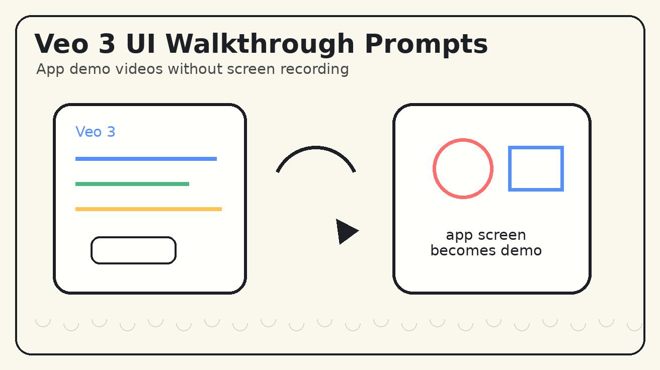
A polished app demo does not always start with a screen recording. Sometimes the product is still in design review, the dashboard contains private customer data, the mobile app flow is too long for social, or the growth team simply needs a fast visual for a launch post. In those cases, Veo 3 UI walkthrough prompts can help you turn screenshots, mockups, landing page frames, and product concepts into short app demo videos that feel clean, intentional, and easy to understand.
This article is a practical guide for marketers, founders, designers, and SaaS teams that want to create app demo videos without recording every click. The goal is not to replace documentation or onboarding training. If the viewer needs exact steps, use a real screen capture. But if the goal is a landing page hero loop, a Product Hunt teaser, a LinkedIn launch clip, a paid social variant, or a sales deck visual, Veo 3 can be useful when the prompt is structured around accuracy.
The key is control. A vague prompt like "make a cool software demo" can produce a plausible but inaccurate interface. A strong Veo 3 prompt names the product category, locks the screenshot, defines one user action, uses a simple timing plan, and blocks fake text or distorted UI elements. Below is the workflow I use when building Veo 3 app demos from product screens.
Why Veo 3 Works for App Demo Videos
App demo videos have a difficult job. They must make a screen feel alive without making the product look fake. A normal screen recording can be accurate, but it often looks flat in ads and social posts. A cinematic video can be engaging, but it may invent interface details that hurt trust. Veo 3 sits between those two needs when you use it carefully: it can add motion, depth, camera movement, and product context around a screen while your prompt protects the core UI.
This is useful for several common situations. A SaaS team may want a hero animation before the final product tour is edited. A founder may need a deck clip that explains a dashboard in one glance. A mobile app marketer may want vertical creative that shows a phone screen without filming a hand-held device. A design team may want to test whether a feature story is visually clear before commissioning a full launch video.
The best Veo 3 UI demos usually focus on one of these outcomes:
- Show a product dashboard becoming easier to understand.
- Turn a mobile app screen into a short social teaser.
- Reveal an AI tool workflow from input to output.
- Create a calm landing page hero loop around a screenshot.
- Make a feature announcement feel more dynamic than a static image.
- Produce multiple ad variants from the same approved interface.
The common thread is simple: the video sells one product benefit, not the entire application.
The Veo 3 UI Walkthrough Prompt Formula
Use a structured prompt instead of a decorative one. The formula below gives Veo 3 enough creative direction while still protecting the product screen.
Create a 15-second Veo 3 UI walkthrough video for [product category]. Use [screenshot/mockup/interface description] as the source. Preserve the exact UI layout, colors, logo, button positions, and visible text. 0-3s: [visual hook]. 3-8s: [interface reveal]. 8-12s: [single feature proof]. 12-15s: [CTA-safe final frame]. Camera: [one camera move]. Style: [clean SaaS/product demo aesthetic]. Avoid fake text, changed numbers, distorted logos, extra buttons, random charts, unreadable labels, and invented product claims.
This formula works because it makes three things explicit. First, it tells Veo 3 what the screen represents. Second, it gives the model a timing plan. Third, it separates creative motion from factual interface content. That separation is the difference between a usable product video and a nice-looking but unsafe demo.
A strong app demo prompt should include these seven elements:
- Source type: screenshot, Figma mockup, mobile frame, landing page capture, dashboard export, or text-only concept.
- Product category: analytics app, CRM, AI editor, ecommerce checkout, booking platform, fintech dashboard, education app, creator tool, or workflow product.
- One user action: upload a file, review a chart, approve a task, generate a result, book an appointment, create a report, or complete checkout.
- Timing beats: one hook, one reveal, one proof moment, and one final frame.
- Camera movement: slow push-in, pull-back reveal, gentle orbit, top-down slide, or phone-in-hand follow.
- Preservation rules: do not change UI copy, logo, colors, positions, screenshots, prices, chart labels, or button shapes.
- Negative constraints: no fake dashboards, random names, unreadable text, impossible metrics, extra fingers, or confusing popups.
If the product claim matters legally or commercially, add it outside the generated video in your editor. Let Veo 3 create the motion, not the final business promise.
Text-Only vs Screenshot-Based Veo 3 Prompts
You can build UI walkthroughs from text-only prompts, but screenshot-based prompts are safer for real products. Text-only prompts are helpful when you are exploring a concept, such as "a clean AI calendar app organizing a busy week" or "a finance dashboard becoming easier to read." That can be useful for mood boards, pitch visuals, and category education.
However, real app demos usually need real interface anchors. If a screen contains your logo, pricing, user data, charts, or conversion-critical copy, start from an approved screenshot or mockup. Then write the prompt around preservation and movement.
A screenshot-based Veo 3 prompt might look like this:
Animate this SaaS dashboard screenshot into a 15-second Veo 3 product demo. Preserve the exact interface layout, logo, colors, visible labels, numbers, and button positions. 0-3s: start close on the main insight card with subtle light movement across the screen. 3-8s: slowly pull back to reveal the full laptop on a clean desk. 8-12s: add gentle depth around the chart area to suggest clarity and workflow progress, without changing any text or numbers. 12-15s: hold on a centered hero frame with clean space on the right for headline overlay. Style: premium SaaS launch video, crisp screen, realistic lighting. Avoid fake charts, random UI text, distorted logo, extra devices, and unreadable labels.
Notice that the prompt does not ask the model to invent a dashboard. It asks the model to animate the dashboard you already approved. That is the right mental model for Veo 3 app demo work.
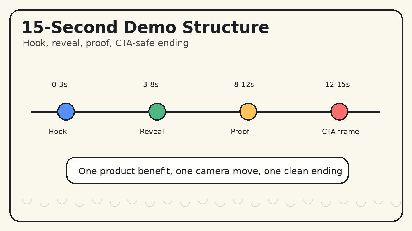
The 15-Second Structure That Works Best
Short app demos should not behave like full tutorials. They should make one benefit obvious in seconds. Use a four-beat structure.
0-3 Seconds: Hook With the Screen
The hook should be visual. Start close on the part of the interface that explains the problem or opportunity. For an analytics product, that might be a key metric card. For an AI editor, it might be the input panel. For a booking app, it might be an empty schedule becoming organized. For an ecommerce tool, it might be a product page transforming into a clean checkout flow.
Good hook instructions include:
- "Start with a close-up on the prompt box as it becomes active."
- "Start from a busy dashboard card and make the main insight feel clear."
- "Start with the phone screen lighting up while the background stays softly blurred."
- "Start on the uploaded file card before the output appears."
Avoid starting with a long abstract scene. In app demo videos, the product screen should appear immediately.
3-8 Seconds: Reveal the Product Context
After the hook, reveal where the screen lives. Is it a laptop on a desk, a phone in a hand, a tablet beside a notebook, or a clean browser window in a studio environment? This context helps the viewer understand the product category without reading a caption.
Keep the camera move restrained. A slow pull-back or push-in usually works better than rapid cuts. Interface videos are already visually dense; too much motion makes the UI harder to read.
8-12 Seconds: Show One Proof Moment
The proof moment should show the benefit, not a list of features. A task board can become organized. A report can become ready to export. A product image can appear beside the editor. A support reply can become visible in a conversation panel. A chart can become visually highlighted.
Do not ask Veo 3 to create fake results that look like real business data. Instead of "show revenue increasing 400%," say "highlight the analytics card and make the workflow feel clearer." If a number matters, put it in the source screenshot or add it later as edited overlay text.
12-15 Seconds: End on a CTA-Safe Frame
The final frame should be useful for marketing. Leave negative space for a headline or CTA overlay. Keep the product screen readable. Do not let the video end mid-gesture.
A good ending instruction is:
End on a steady hero frame with the product screen centered and clean background space on the left for edited CTA text. Do not generate CTA text inside the video.
This gives the designer control and helps the clip work across ads, landing pages, and social posts.
Copy-and-Paste Veo 3 UI Walkthrough Prompts
Use these templates as starting points. Replace the bracketed details with your product information.
Template 1: SaaS Dashboard Hero Loop
Create a 15-second Veo 3 UI walkthrough for a SaaS analytics dashboard. Use the uploaded screenshot as the source. Preserve the exact layout, logo, colors, chart labels, numbers, and button positions. 0-3s: close-up on the main insight card with soft studio light moving across the screen. 3-8s: slow pull-back reveals a laptop on a minimal desk. 8-12s: gentle depth movement around the dashboard cards to suggest clarity and decision-making, without changing any UI text. 12-15s: hold a centered hero composition with negative space on the right for headline overlay. Style: premium B2B SaaS launch video, crisp screen, realistic lighting. Avoid fake charts, random labels, changed numbers, distorted logo, clutter, and unreadable text.
Template 2: Mobile App Demo Without Recording
Create a vertical 15-second Veo 3 app demo for a mobile [category] app. Preserve the uploaded phone screen exactly, including UI text, colors, and button positions. 0-3s: phone screen lights up in a natural hand-held shot. 3-8s: camera follows a slow thumb movement toward the main action area, but do not invent new screens. 8-12s: show a subtle result animation around the existing screen, such as a card lifting or progress completing. 12-15s: end with the phone centered and clean background space above for caption text. Style: realistic creator-style product demo, mobile-first, clean lighting. Avoid fake text, changed buttons, distorted phone edges, extra fingers, and random notifications.
Template 3: AI Tool Input-to-Output Clip
Create a 15-second Veo 3 UI walkthrough for an AI creation tool. Use the source screenshot as the interface anchor. Preserve all visible UI text, brand colors, logo, and layout. 0-3s: close-up on the input panel as the task begins. 3-8s: camera pulls back while the interface remains sharp and stable. 8-12s: show a visual before/after result beside the app screen, without changing the real UI copy. 12-15s: hold on the final output and the preserved interface in the same frame. Style: clean AI product launch aesthetic, crisp screen, subtle motion. Avoid fake pricing, invented claims, random icons, unreadable labels, and distorted UI.
Template 4: Product Launch Feature Announcement
Create a 15-second Veo 3 feature announcement video for [feature name]. Use the approved screenshot as the source. Preserve the interface exactly. 0-3s: close-up on the feature panel or primary button area. 3-8s: one slow push-in reveals the full product screen. 8-12s: show the feature outcome with subtle UI motion and light, not new generated text. 12-15s: hold on a clean final frame with negative space for edited headline and CTA. Style: polished startup launch video, bright but professional. Avoid fake data, changed labels, random popups, aggressive zooms, and unreadable buttons.
Template 5: Sales Deck Product Visualization
Create a 15-second Veo 3 product visualization for a sales deck. The main object is a laptop showing the provided product screenshot. Preserve the UI layout, text, logo, colors, and chart positions. 0-3s: start close on the strongest proof area of the interface. 3-8s: pull back to show the laptop in a clean meeting-room context. 8-12s: add subtle parallax around the screen while keeping all UI details stable. 12-15s: end on a steady frame suitable for a slide background. Style: credible enterprise software demo, calm motion, high trust. Avoid fake customer names, invented metrics, distorted interface, and excessive visual effects.
Preservation Rules for UI Accuracy
Preservation rules are the heart of a Veo 3 UI walkthrough prompt. Style words like "modern" and "cinematic" help, but they do not protect the interface. If the output changes your product, the clip becomes risky.
Use these lines often:
- "Preserve the exact UI layout and all visible text."
- "Do not invent new menu items, buttons, charts, or prices."
- "Keep the logo, brand colors, and button positions unchanged."
- "Animate the environment and camera, not the factual UI content."
- "No fake notifications, no random customer names, no unreadable labels."
- "Leave CTA copy for post-production editing."
For regulated or high-trust categories, be even stricter. Finance, healthcare, legal, education, and enterprise security products should avoid generated claims inside the video. Use approved copy in overlays and landing page text instead.
Best Camera Moves for Veo 3 App Demos
The interface should stay readable, so use one primary camera movement per clip.
A slow push-in works when you want to emphasize a feature panel, prompt box, button, or result card. It helps guide attention without creating false interaction.
A pull-back reveal works for hero videos. Start close on a detail, then reveal the full laptop or phone in context. This move is reliable for SaaS landing pages and launch posts.
A gentle orbit adds depth around a laptop or tablet. Keep it slow. Fast orbits can make UI text unreadable and may distort screen edges.
A top-down slide works for planning apps, design tools, boards, and workflow products. It feels organized and is useful when the viewer needs to understand a layout.
A phone-in-hand follow is strong for mobile apps, but it needs constraints. Ask for natural hand motion, no extra fingers, no warped phone edges, and a stable readable screen.
If the clip needs multiple camera moves, make multiple videos. One prompt should not try to become a complete product trailer.
QA Checklist Before You Publish
A generated app demo should pass a stricter review than a normal creative asset because it represents the product. Pause the video on important frames and inspect the details.
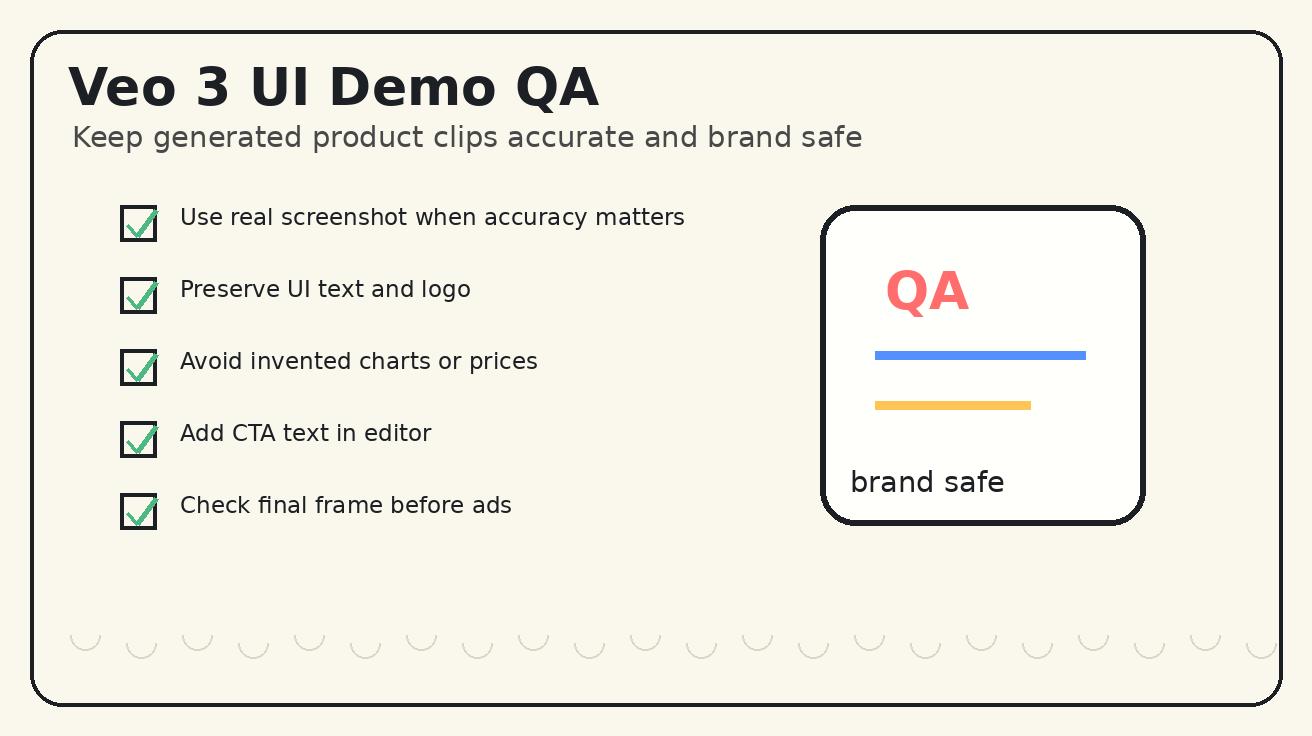
Check these items:
- UI accuracy: Are layout, colors, logo, labels, buttons, and main cards still correct?
- Text readability: Is any visible text distorted, random, or misleading?
- Claim safety: Did the video invent metrics, customer names, pricing, or unsupported promises?
- Motion clarity: Does the movement help explain the product, or does it distract?
- Crop safety: Does the important UI remain visible in vertical, square, and horizontal versions?
- CTA space: Is there room to add edited headline or button copy later?
- Brand consistency: Does the environment match the product tone?
- Loop quality: Does the ending feel intentional and reusable?
If the video fails the accuracy check, regenerate with stronger preservation rules. If it fails the message clarity check, simplify the concept. Most winning app demo clips communicate one benefit extremely clearly.
Where Veo 3 UI Walkthroughs Fit in the Funnel
Veo 3 app demo videos are especially useful at the top and middle of the funnel.
For paid social, generate several variants from the same screenshot. One version can be a close-up dashboard reveal, one can be a phone-in-hand demo, one can be a before/after concept, and one can be a calm hero loop. Keep the claims outside the video so ad copy remains editable.
For landing pages, use a horizontal hero loop with low motion and high readability. The video should support the headline, not compete with it. A visitor should understand the category in two seconds.
For launch posts, use a screenshot of the new feature and a four-beat prompt. The copy can explain the details while the video earns attention in the feed.
For sales decks, use credible product visualizations instead of loud effects. Enterprise buyers respond better to clarity and trust than to dramatic camera tricks.
For community announcements, create vertical teasers that show one problem becoming one result. The comments, changelog, or documentation can handle the full explanation.
Common Mistakes to Avoid
The most common mistake is asking Veo 3 to generate exact UI from imagination. The model may create a beautiful dashboard that is not your product. Use screenshots when accuracy matters.
The second mistake is trying to show too many features. A 15-second clip cannot explain onboarding, analytics, billing, collaboration, export, and support. Choose one user action and one result.
The third mistake is using generated text as final copy. Interface text, pricing, compliance language, and CTA claims should come from approved source files or post-production overlays.
The fourth mistake is over-directing the camera. App screens are dense. Too many cuts, zooms, or spins make the product harder to understand.
The fifth mistake is skipping review. A clip can look impressive at full speed but contain incorrect frames when paused. Review the final video like a product page, not just like a creative asset.
Recommended Workflow for Teams
Here is a simple production workflow:
- Export one clean screenshot or mockup with private data removed.
- Decide the single product benefit the video should communicate.
- Choose the target format: vertical social, horizontal hero, square ad, or deck background.
- Write a four-beat Veo 3 prompt with preservation rules.
- Generate two or three variants changing only the hook or camera move.
- Select the most accurate output, not the most dramatic one.
- Add real captions, CTA text, logo lockup, and disclaimers in your editor.
- Publish and measure CTR, watch time, scroll depth, and conversion quality.
This process keeps Veo 3 in the role where it is strongest: creating polished motion around a product story while your team remains responsible for exact claims and interface truth.
FAQ
Can Veo 3 create app demo videos without screen recording?
Yes, Veo 3 can help create product demo visuals, launch teasers, and UI walkthrough concepts from screenshots, mockups, or structured prompts. Use real screen recordings for exact click-by-click training, and use Veo 3 for polished marketing motion around a product screen.
What is the best prompt structure for a Veo 3 UI walkthrough?
Use one product category, one source screen, one user action, a 0-3/3-8/8-12/12-15 second timing plan, one camera move, and strict preservation rules. Add negative constraints against fake text, distorted logos, invented charts, and unreadable buttons.
Should I use screenshots or text-only prompts for Veo 3 app demos?
Use screenshots or approved mockups when UI accuracy matters. Text-only prompts are useful for concept exploration, but screenshot-based prompts are safer for SaaS ads, landing page hero loops, investor decks, and product launches.
How do I keep UI text readable in Veo 3 demos?
Start with clean source artwork, tell Veo 3 to preserve the existing UI, avoid asking it to generate precise interface copy, and add headlines or CTA text later in an editor. Review paused frames before publishing.
How long should a Veo 3 app demo video be?
For social and landing page use, 10 to 15 seconds is usually enough. Show one hook, one interface reveal, one proof moment, and one CTA-safe ending instead of trying to explain the whole product.
Are Veo 3 UI walkthroughs safe for SaaS marketing?
They can be useful when you review outputs carefully and keep business claims under editorial control. Do not publish clips with fake metrics, altered prices, unreadable UI, or product behavior that the real app cannot support.
Conclusion
Veo 3 UI walkthrough prompts work best when you treat them like product marketing briefs. Start from a clean screenshot when accuracy matters. Give the model one product benefit, one user action, one camera movement, one proof moment, and one CTA-safe ending. Use preservation rules aggressively. Add exact claims and CTA text in your editor, not in the generated frames.
This workflow helps teams create app demo videos without waiting for a full screen recording and editing cycle. It is especially useful for launch posts, SaaS hero loops, paid social variants, founder decks, and feature announcements. Keep the prompt structured, review the output carefully, and let Veo 3 make the product screen feel alive without compromising trust.
Explore more Veo 3 workflows on the Veo 3 blog, compare prompting patterns in our Veo 3 prompt guides, and use screenshot-based demos when your product story needs accuracy before style.
Related Articles
Continue with more blog posts in the same locale.
Veo 3 SaaS Demo Video Generator 2026: Product Tours and Feature Launch Clips
Use Veo 3 for SaaS product tours, feature launch clips, onboarding previews, and B2B demo videos without losing product accuracy.
Read article
Veo 3 Safety Filters 2026: Real Faces, Logos, Audio, and Prompt Rewrites
A practical Veo 3 safety filters guide for real faces, logos, audio, blocked prompts, and policy-safe prompt rewrites in 2026.
Read article
Veo 3.1 Lite: What It Is, How to Use It, and Is It Free?
Complete guide to Veo 3.1 Lite announced at Google Cloud Next 2026. What it is, how to access it, is it free, and how to use it for video creation.
Read article