
Filmic Color Grading for Camera and AI Video
Learn filmic color grading with log, Rec.709, LUTs, and secondaries, then apply the same look to AI-generated footage.
Veo3 AI · 16 min read · Nov 2, 2026
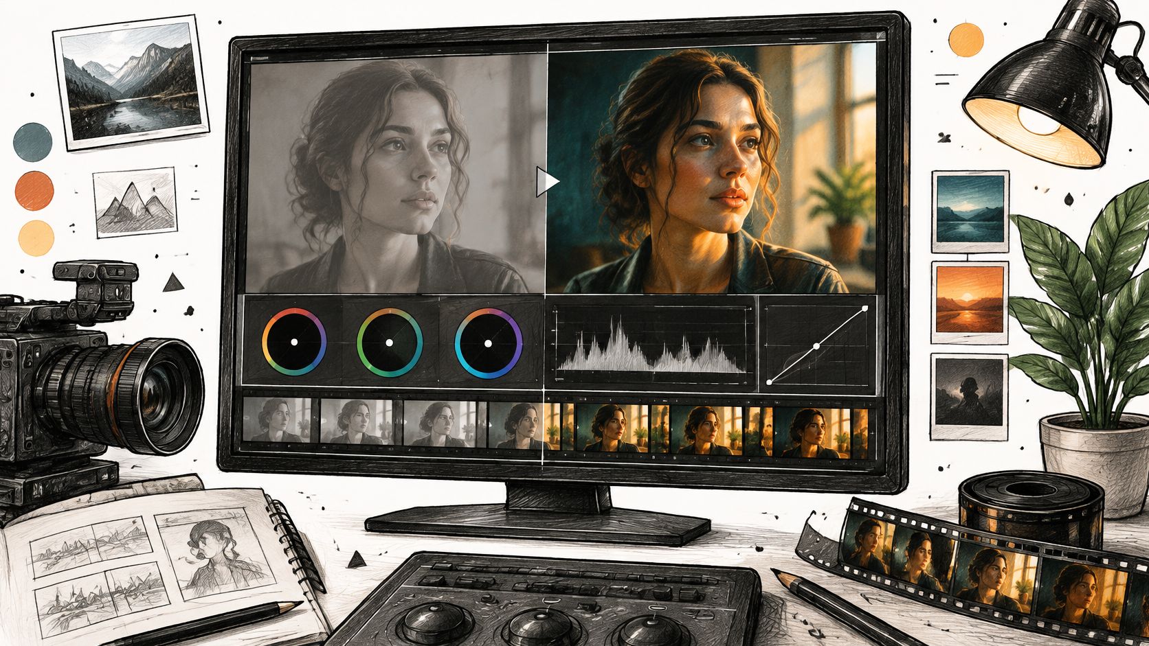
The most popular advice about filmic color grading starts too late: choose a cinematic LUT, add grain, and push shadows toward teal. That can decorate a stable image, but it won't fix exposure that wanders, skin that changes hue, or shots that don't belong together. On unstable AI footage, a stronger look often makes those problems easier to see.
A convincing filmic image starts with controlled contrast, believable color, and continuity across the cut. Whether you're grading camera log or generated video, establish those foundations before print emulation or stylized color separation. The useful question isn't which preset looks cinematic. It's which correction the image needs next.
Table of Contents
- What Filmic Color Means on a Display
- How to Grade from Log to Delivery
- Use LUTs and Film Emulation with Restraint
- Secondary Corrections for Skin and Objects
- Tips for Unstable AI-Generated Footage
- Sign Off the Master and Grade the Next Clip
<a id="what-filmic-color-means-on-a-display"></a>
What Filmic Color Means on a Display
A preset pack doesn't define a filmic look. You might want soft highlight rolloff, textured shadows, restrained saturation, or warm faces against a cool background. None of those choices works reliably unless your grading system knows how the image should appear on the delivery display.
Separate gamut, the range of reproducible colors, from tonal response, the relationship between image values and displayed brightness. A larger gamut doesn't automatically produce better contrast, and an HDR label doesn't make an image cinematic. These are delivery conditions, not aesthetic shortcuts.
<a id="the-delivery-space-sets-the-boundaries"></a>
The delivery space sets the boundaries
Rec.709 was introduced in 1990, while digital cinema display requirements were formalized in the 2007 DCI specifications, according to Christie's color-space technical brief. The document's comparisons put visible-spectrum coverage at about 35.9% for Rec.709, 53.6% for DCI-P3, and 75.8% for Rec.2020, and describe P3 as roughly 26% larger than sRGB/Rec.709.
Delivery spaces that change a filmic grade
| Color space | Visible spectrum | Typical delivery | What fails if ignored |
|---|---|---|---|
| Rec.709 | About 35.9% | HDTV, broadcast, and web SDR | Wider-gamut colors can look dull after poor conversion, and incorrect display response can distort contrast |
| DCI-P3 | About 53.6% | Theatrical digital cinema under the 2007 DCI specifications | Saturated reds, greens, and yellows can clip or dull in a Rec.709 master |
| Rec.2020 | About 75.8% | Wide-gamut HDR | Color can look oversaturated or wrong when treated as SDR without a transform |
Read this as a delivery lookup, not a ranking. A carefully finished Rec.709 video can look excellent on a phone. A cinema-space image exported without the right conversion can look wrong even though its working gamut was larger.
<a id="contrast-needs-the-right-viewing-response"></a>
Contrast needs the right viewing response
Rec.709 identifies the HD color space, while BT.1886 describes the reference display response, with an effective gamma near 2.4 in a dark suite; some consumer viewing guidance describes an apparent response nearer 2.2, as summarized in The Post Flow's color-space reference. Don't confuse that distinction with a saturation adjustment.
Say a red jacket looks rich on your grading display but loses detail in a web export. Check the output conversion before reducing red saturation throughout the scene. Otherwise, you'll compensate for a delivery error by changing an otherwise sound grade.
Delivery rule: Build the look in a managed working space, then make a separate master for theatrical P3, Rec.709 web or broadcast, or an appropriate HDR target.
<a id="how-to-grade-from-log-to-delivery"></a>
How to Grade from Log to Delivery
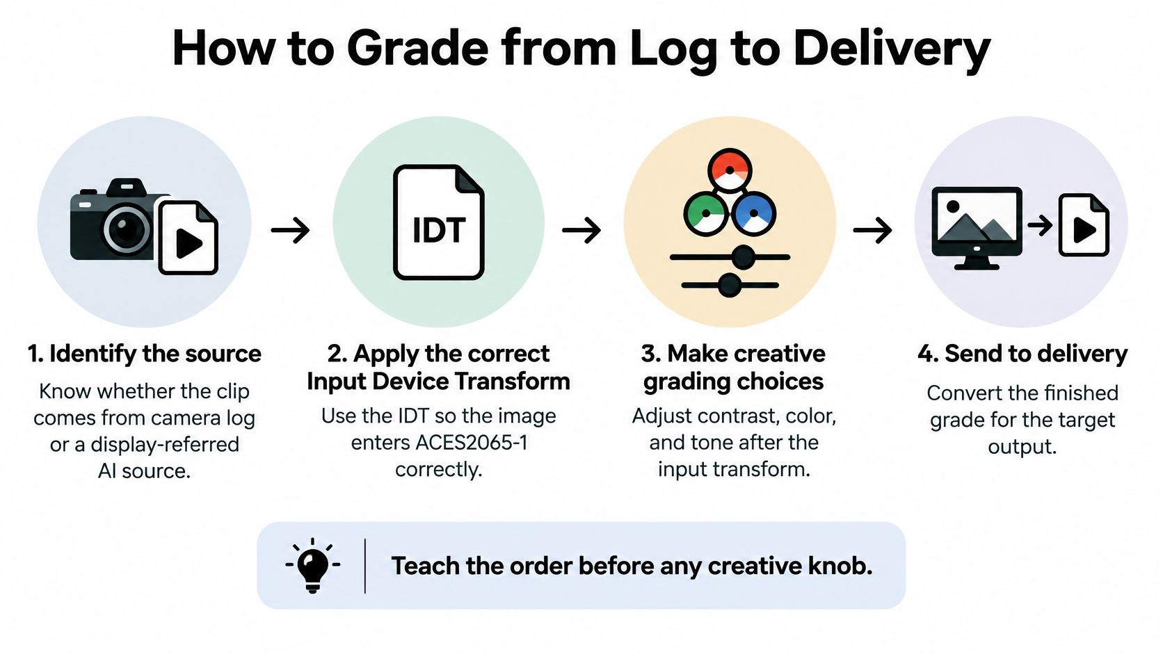
Teach the order before any creative knob. In DaVinci Resolve, color management can handle transforms at project level, or you can build an explicit node-based pipeline. Either approach works, but don't unknowingly perform the same conversion in both places.
ARRI's ACES explanation distinguishes input transforms, grading-space operations, and display output transforms. Treat those as separate jobs, not interchangeable presets.
The process starts with identifying what the file contains.
<a id="establish-a-trustworthy-image"></a>
Establish a trustworthy image
-
Identify the source and assign its input transform. Read camera metadata and confirm the log curve and gamut. Apply the matching Input Device Transform, or IDT, to bring camera material into ACES2065-1. For a display-referred AI export, assign its actual encoding through the appropriate input conversion rather than pretending it's camera log. Getting this wrong shifts exposure and hue before you've made a creative decision.
-
Balance in ACEScct. Correct white balance, exposure, and broad contrast with the output view enabled. ACEScct's logarithmic response and shadow toe make grading adjustments more manageable than working directly in linear scene values. Don't try to create the final mood yet; make the room, subject, and neutral objects believable.
-
Place black and white points, then shape the tones. Use the waveform to check where important shadows and highlights sit. Lift primarily affects shadows, gamma adjusts midtones, and gain changes highlights, as described in Image Studio's cinematic grading guide. Individual red, green, and blue controls let you warm highlights without warming every dark surface.
Avoid forcing every scene to the same endpoints. A foggy exterior shouldn't have the same deep blacks as a hard-lit night scene. Set tonal anchors that suit the photographed light, rather than stretching each shot until it fills the scope.
<a id="build-continuity-before-style"></a>
Build continuity before style
-
Match neighboring shots. Choose a representative reference shot, then compare faces, neutral surfaces, and background brightness across the edit. A close-up may need different settings from a wide shot to feel equally exposed. If you skip this stage, a shared look will preserve the mismatch rather than remove it.
-
Add the creative look and targeted corrections. Shape the contrast curve, palette, and saturation after the base is dependable. Place skin or object corrections before or after the creative node according to what they're fixing, but keep them upstream of the final output transform. Label nodes by function so you can distinguish balance from styling.
-
Transform for delivery and archive separately. Use the appropriate Output Device Transform, or ODT, for the intended master. Keep a scene-referred archive apart from the display-rendered export so a later delivery doesn't require rebuilding the grade from a finished SDR file.
ACES2065-1 can represent every visible color and a dynamic range exceeding 30 camera stops, according to the ACES system overview. That's storage and interchange capacity, not a look, and converting an AI export into it doesn't recover missing scene information.
Watch for duplicate transforms. An incorrect or repeated input conversion damages the starting image. A viewing LUT that already renders for a display, followed by another output rendering transform, can create excessive contrast, clipped highlights, and crushed shadows. Stop the balancing pass when the short cut plays without unintended brightness or white-balance pops.
<a id="use-luts-and-film-emulation-with-restraint"></a>
Use LUTs and Film Emulation with Restraint
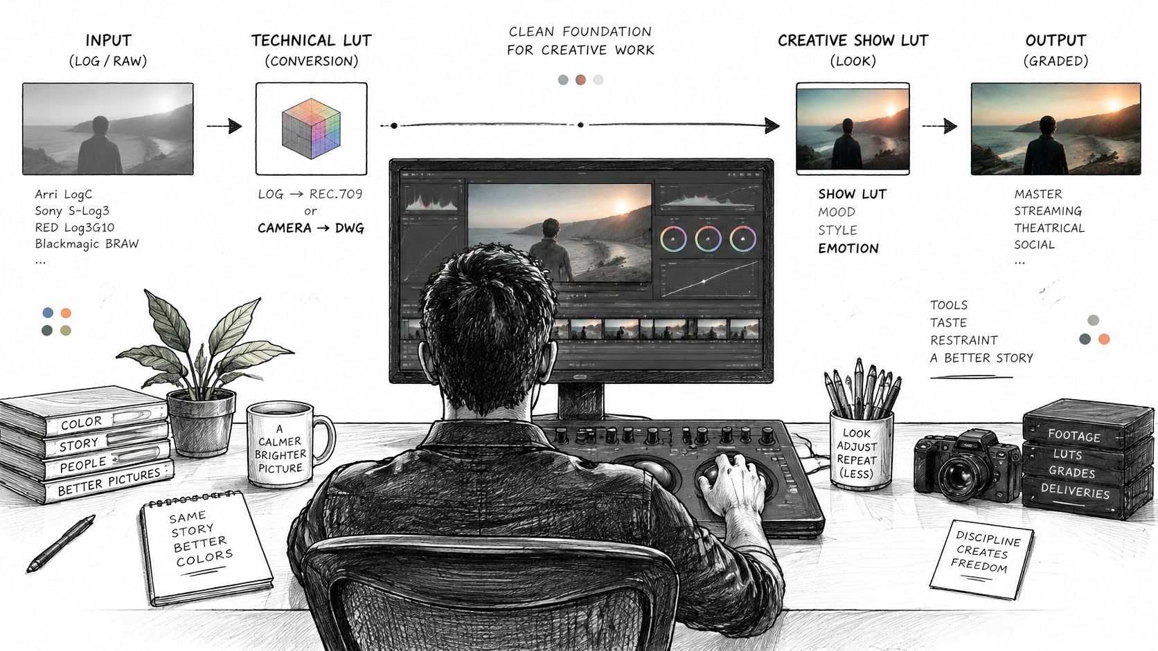
A LUT, or lookup table, maps incoming color values to outgoing values. Its position in the pipeline matters because it expects a particular kind of input. A technical conversion LUT and a creative show LUT aren't substitutes for each other.
Keep the source, balance, look, and output stages distinguishable in your grading workspace.
<a id="give-each-lut-a-defined-job"></a>
Give each LUT a defined job
A technical conversion LUT belongs at the relevant conversion stage only when color management isn't already doing that job. A creative LUT usually follows primary balancing, but you must still check its expected input and output spaces. Some show LUTs include display rendering, so they can't sit before an additional ODT.
For a hypothetical starting point, try a creative LUT at 20% to 40% mix, then rebuild the contrast you need with curves. This isn't a standard or a quality threshold. It's a way to inspect the palette without immediately accepting the LUT's entire contrast treatment.
Treat film emulation as separate, adjustable ingredients:
- Highlight shoulder: Compress bright tones gradually rather than flattening them against a hard ceiling.
- Color separation: Introduce cooler shadows and warmer highlights only where the scene supports that relationship.
- Texture: Add grain or halation lightly enough that eyes, facial detail, and small text remain readable on a phone.
<a id="a-useful-shoulder-and-a-destructive-print-look"></a>
A useful shoulder and a destructive print look
Say you're grading a daylight interview shot in log beside a bright window. After balancing the face, a gentle shoulder can preserve the transition through the curtains into the brightest exterior areas, provided those details exist in the source. It can't restore a window that was already clipped during capture.
Now consider a night street clip with an almost-black coat. A strong print LUT may merge the coat with the background and turn its remaining shadow detail teal. Reduce or remove the look before lifting everything else to compensate.
Use the video demonstration to examine changes in tonal separation, not just the appeal of the finished palette.
<iframe width="100%" style="aspect-ratio: 16 / 9;" src="https://www.youtube.com/embed/yrrW-V8bO_I" frameborder="0" allow="autoplay; encrypted-media" allowfullscreen></iframe>
Skip the LUT when an already contrasty Rec.709 social clip needs only small corrections. Also postpone it when an AI shot's exposure is still wandering, because the look can exaggerate those fluctuations.
Toggle the LUT off. If the story disappears, the look was doing the lighting's job.
<a id="secondary-corrections-for-skin-and-objects"></a>
Secondary Corrections for Skin and Objects
A face can look wrong even when the overall frame looks balanced. Secondary corrections let you change selected regions or colors without shifting everything around them. Keep this work after shot matching and before the final output transform.
Start with the object viewers need to read, not every color you could improve. For an interview, that's usually the face. In a product ad, the package may deserve equal attention.
<a id="isolate-the-subject-without-painting-the-wall"></a>
Isolate the subject without painting the wall
Use a hue and luminance qualifier to select skin, then inspect the matte rather than trusting the normal image alone. Refine it until the useful facial areas are included without chasing every pore or tiny lighting variation. A brittle, speckled selection rarely produces a smooth correction.
Add a soft tracked window or mask around the face to exclude similarly colored walls, wood, or clothing. The qualifier chooses a color range; the window limits where that selection can act. Use both when either one alone would affect unrelated objects.
Nudge skin toward a plausible vectorscope direction without forcing every complexion to the same saturation or brightness. The skin-tone line is a diagnostic guide, not a destination that overrides lighting, complexion, or creative intent. If cheeks become intensely saturated while the forehead still looks reasonable, reduce the problematic range instead of desaturating the whole image.
For other important elements, keep the corrections separate:
- Practical lights: Reduce an intrusive color cast without making the lamp itself look neutral and lifeless.
- Product color: Compare the package against an approved reference under an appropriate viewing condition.
- Sky or background: Clean up a distracting hue only if it competes with the subject or breaks continuity.
<a id="recognize-when-the-selection-is-the-problem"></a>
Recognize when the selection is the problem
Mixed lighting can put warm and cool regions on the same face. A single aggressive hue rotation may fix one cheek while damaging the other. Try broad, feathered regional adjustments that respect the light's direction.
A bright window behind the subject creates another trap. If lifting the face also lifts the window edge, tighten the spatial boundary gently and improve tracking rather than increasing contrast to hide the halo. Watch the correction in motion, particularly when the head crosses the bright background.
On AI footage, changing face hue can cause a static qualifier to drop in and out. Use a broader, gentler adjustment rather than a narrower key that chatters; severe instability calls for a source decision, not endless matte refinement.
Check one close-up at normal playback speed and at a useful inspection size:
- Skin isn't neon: Cheeks retain believable color variation.
- Eyes aren't gray: The correction hasn't drained surrounding facial detail.
- Product color is unchanged: The skin node doesn't contaminate the hero object.
- Edges are clean: No halo appears where the face meets the window.
<a id="tips-for-unstable-ai-generated-footage"></a>
Tips for Unstable AI-Generated Footage
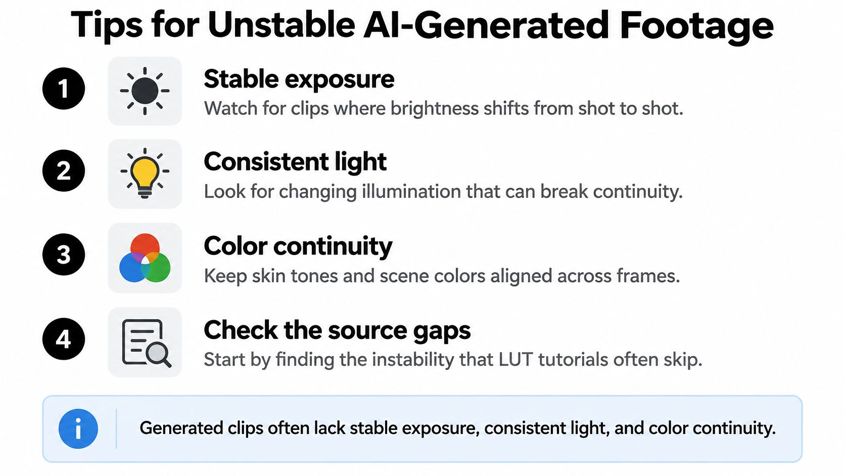
A 2025 exploratory study of an AI-produced short film, available through Sogang University's scholarly repository, found difficulties with character consistency, complex motion, and accurate color that required human intervention and professional post-production grading. That's a limitation of the source material, not a reason to choose a stronger preset.
Generated clips can contain both ordinary grading problems and changes that aren't physically coherent. A slightly dark face is gradeable. A face whose apparent material or illumination changes during the shot needs a different diagnosis.
A cinematic LUT cannot rescue an inconsistent source.
<a id="decide-whether-to-grade-or-regenerate"></a>
Decide whether to grade or regenerate
Play the entire shot before touching a color wheel. Mark brightness flicker, hue jumps, and plastic-looking skin separately from steady underexposure or an overall color cast. Then inspect adjacent selects for changes in identity, wardrobe, and light direction.
Use these source checks before committing to a look.
AI footage problems and whether to grade them
| Problem | Better response | Check before the look |
|---|---|---|
| Exposure drift between shots | Normalize, then grade | Waveform stays in range across the cut |
| Hue flicker on skin | Gentle secondary, or regenerate if it chatters | Skin stays near one vectorscope line |
| Identity, wardrobe, or light direction changes | Regenerate from a reference | Continuity holds before any LUT |
| One pretty frame, a bad cut | Do not trust the still | Watch temporal consistency after compression |
The vectorscope check means a stable, believable hue direction, not identical readings for every face. Likewise, a waveform that stays within range doesn't guarantee a good match. Compare the subject's brightness and the visual emphasis at the cut.
<a id="make-correction-effort-part-of-selection"></a>
Make correction effort part of selection
-
Revise structural problems first. If a jacket changes color because the wardrobe itself changes, revise the prompt or reference image. Don't spend the grading pass disguising a continuity error that viewers can still recognize.
-
Normalize the chosen shots. Match exposure and neutral balance across the actual edit, not across an unrelated collection of attractive generations.
-
Protect faces and hero objects gently. Favor soft masks and modest adjustments. A global LUT can't isolate a subject, which is why local corrections still need deliberate control, a limitation also discussed in the LumiVideo grading evaluation.
-
Apply a shared look, then test the compressed result. Watch for temporal instability, skin-tone drift, clipped highlights, and discolored shadows after export and platform processing.
For the broader workflow question, freispace's resource on AI integration in post-production provides context for deciding where automation belongs. For grading-focused techniques, use the AI color grading guide alongside your own moving-image checks rather than treating an automated result as final.
When comparing models, use the same prompt or reference image and the same baseline grade. Keep a simple scorecard for exposure stability, skin continuity, object consistency, and correction effort. Choose the clip that survives an edit with manageable intervention, not the model that produces the most striking isolated still.
<a id="sign-off-the-master-and-grade-the-next-clip"></a>
Sign Off the Master and Grade the Next Clip
Choose a short sequence from one scene rather than testing unrelated images. For example, assemble three to six shots containing a wide view, a closer face, and an important object. That hypothetical exercise gives you different image scales without turning the test into a full production.
Run the sequence through a consistent order: input conversion, ACEScct balance, shot matching, secondaries, creative look, and output transform. In this test, placing corrective secondaries before the creative look makes it easier to see whether the shared styling treats each balanced shot predictably. Keep any necessary finishing trims clearly labeled.
<a id="approve-the-export-you-will-actually-deliver"></a>
Approve the export you will actually deliver
Confirm the master target before rendering. Use Rec.709 for conventional web or broadcast SDR, DCI-P3 for the appropriate theatrical workflow, and HDR only when the receiving platform and your monitoring setup support the intended format. Name the export so its target is unambiguous.
Watch the cut on the grading display, then on a phone. The phone isn't a replacement for reference monitoring, but it reveals whether the subject remains readable at the size and brightness conditions viewers may use.
Use this sign-off checklist on the rendered file:
- Matched exposure: Faces and important objects don't jump in brightness across the cut.
- Stable white balance: Neutral surfaces don't suddenly shift green, magenta, warm, or cool at an edit.
- Believable skin: The vectorscope supports what you see rather than revealing an unintended hue excursion.
- Controlled highlights: Bright areas retain a gradual transition wherever the source contains usable detail.
- Compression survival: Shadows, texture, and facial color remain readable after platform processing.
Don't approve from the editing timeline alone. Check the beginning and end of the exported file, verify that the intended version rendered, and review the platform-processed upload before publishing. Keep the scene-referred master, source assignments, and grading project separate from the display render.
<a id="make-the-next-test-comparable"></a>
Make the next test comparable
For fresh material, our Veo 3 AI video generator offers text-to-video generation that turns a prompt into a cinematic AI video in minutes. We offer Veo 3.1, with generation up to 4K and first and last frame control for continuity tests, plus Gemini Omni Flash 1.1, which generates 4 to 10 second videos at up to 4K.
Keep your lighting description, reference choices, and test edit consistent when generating replacements. Run each new select through the same pipeline, and resist building a different LUT for every clip. The useful outcome is a repeatable grade that accepts coherent footage, not a growing collection of presets that conceal incompatible sources.
Veo3 AI offers text-to-video and image-to-video tools for creating the short shots you need to practice filmic color grading. Visit Veo3 AI, generate a small continuity test, and judge the result by how well exposure, skin color, and the finished look survive the cut.
Related Articles
Continue with more blog posts in the same locale.
Creating Video Loops That Restart Without a Jump
Creating video loops that restart cleanly, with frame matching, export settings for Shorts and backgrounds, and a replay test.
Read article
Whip Pan Shot Guide: How to Shoot and Recreate One with AI
Learn what a whip pan shot is, how to film it with the right shutter settings, edit it into a seamless cut, and recreate it with AI video prompts.
Read article
First Persons Point of View: How to Film It
Learn first persons point of view for film and AI video, including lenses, movement, audience fit, and comfort.
Read article