
Social Media Video Sizes: The 2026 Spec Sheet
Master social media video sizes in 2026 with platform-by-platform specs, aspect ratios, export presets, and safe-area tips for every major network.
Veo3 AI · 22 min read · Sep 19, 2026
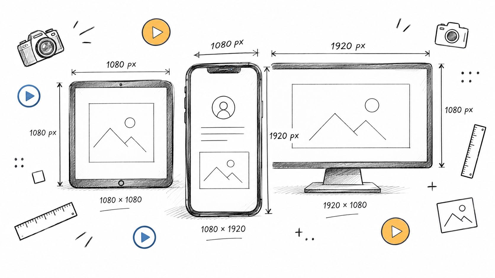
Short-form video behavior changed the specs conversation. On Instagram, 52% of social users gravitate toward short-form video under 60 seconds, and on TikTok, 60% of users say short-form video under 60 seconds is their most frequent interaction format according to Socialinsider's coverage of 2026 video benchmarks. That's the reason social media video sizes matter now. Not because 1080 × 1920 looks tidy on a spec sheet, but because the frame, file, and export choices directly affect whether a video feels native in the feed.
Most platform guides still stop at dimensions. That's not enough if you ship campaigns every week. Producers need to know which ratio survives overlays, which codec gets mangled less on upload, when square still makes sense, and how to build one vertical master that can be pushed into five placements without breaking captions or cropping heads.
Why 9 - 16 Now Owns the Social Feed
On Instagram alone, portrait video outperformed 16:9 in a 2026 comparison cited earlier, with higher views, longer watch time, and more interactions. That gap explains why 9:16 stopped being a formatting preference and became the default delivery frame for short-form social.
The practical reason is simple. Full-screen vertical uses the entire phone display, keeps attention inside the player, and leaves enough room for burned-in captions, product callouts, UI demos, and creator framing without wasting space at the top and bottom. A horizontal clip can still work, but in a vertical feed it usually looks like a repurposed asset, not a native one.
Platform spec guides reflect that reality. Sendible's social media video specs guide lists 9:16 as the recommended format across Reels, Stories, TikTok, Shorts, and Facebook Reels, while standard long-form placements still center on 16:9.
That matters at export time, not just at ideation. I usually treat 1080 x 1920 as the master delivery canvas for short-form campaigns because it survives the most placements with the fewest compromises. It also gives editors and motion teams a cleaner path for versioning. Build captions too low, frame faces too tight, or export with an overly aggressive bitrate, and the penalty shows up as lower retention, messy recompression, or text colliding with platform chrome.
Here is the working reality.
| Platform | 9:16 Fit | 1:1 Fit | 16:9 Fit | Primary Feed |
|---|---|---|---|---|
| Best fit for Reels and Stories, strong for vertical feed placements | Still usable in feed | Usually weaker for mobile-first discovery | Reels, Stories, Feed | |
| TikTok | Native format | Limited use | Poor fit for For You viewing | Full-screen For You feed |
| YouTube Shorts | Native format | Rare | Better for standard YouTube uploads | Shorts shelf and mobile player |
| Facebook Reels | Native format | Secondary option | Better reserved for horizontal video placements | Reels feed |
Practical rule: Start with a 9:16 master for any short-form campaign, then crop out to other placements only when the destination justifies it.
This is also where a lot of AI-generated video falls apart. Tools can output vertical frames, but they often miss safe zones, subtitle spacing, and subject scale unless you prompt for those constraints up front. If your team is building synthetic or hybrid creative, Veo 3 vertical video 9:16 workflows are worth reviewing because generation settings affect whether the asset can ship across Reels, TikTok, and Shorts without rework.
9:16 owns the feed because it tends to perform better, wastes less screen space, and creates fewer production problems once the edit hits export.
The Core Aspect Ratios You Need to Know
Specs get easier once you stop treating every platform like a separate universe. Most social media video sizes now fall into a small working set, and each one maps to a specific viewing surface.
The four shapes that actually matter
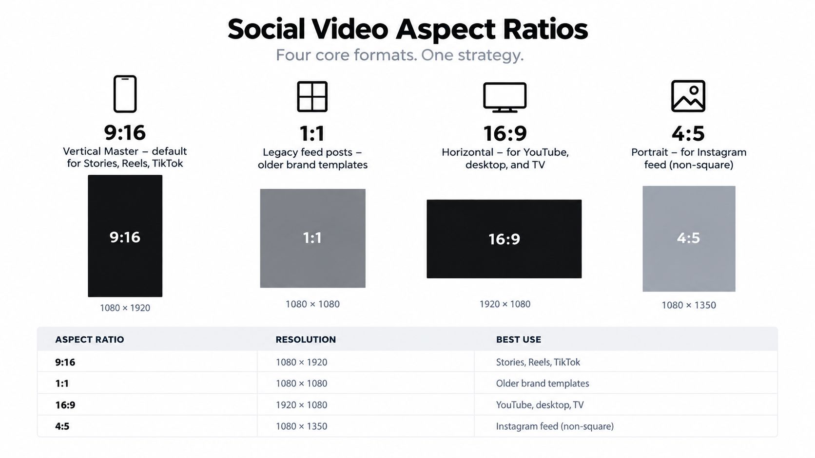
9:16 at 1080 × 1920 is the vertical master. It belongs in Reels, Stories, TikTok, Shorts, and any mobile-first placement where the player goes full screen.
1:1 at 1080 × 1080 is still useful, but mostly for older brand templates, legacy feed systems, and situations where a team already has square creative baked into approvals.
16:9 at 1920 × 1080 still matters for standard YouTube, embedded website video, webinar cutdowns, and any placement where desktop or TV viewing is part of the plan.
4:5 at 1080 × 1350 is the feed-friendly portrait option that often works better than square in non-Reel social feeds because it takes up more vertical space without going full-screen.
The ratio most articles skip
One under-covered wrinkle is that newer guides also note 3:4 vertical feed formats and 4:5 portrait layouts as relevant mobile-first surfaces, rather than collapsing everything into the old 9:16, 1:1, and 16:9 model, as noted in this 2026 format overview. That matters when you're exporting for the feed itself, not just for Stories or Reels.
For teams that need a practical companion reference, this guide to video dimensions for app publishing is useful because it frames the ratios by publishing context rather than by raw dimensions alone.
A simple working rule helps:
- Use 9:16 when the player is meant to fill the phone.
- Use 4:5 when the content lives in a scrollable feed and you want more presence than square.
- Use 1:1 when brand systems or old templates force it.
- Use 16:9 when the destination is YouTube, a landing page, or a screen larger than a phone.
Instagram Reels, Stories, and Feed Video Specs
Instagram compresses more aggressively than many teams expect, and small layout mistakes show up fast. A file can meet spec and still underperform because captions sit under the UI, the cover frame reads poorly in feed, or the export falls apart after Instagram re-encodes it.
Reels and Stories
Use 1080 × 1920 at 9:16 for both Reels and Stories. The current limits summarized in Bevyl's social media sizes reference list Reels at up to 3 minutes with a 4 GB cap. Those numbers matter less than how the asset survives compression and framing on a phone.
My default Instagram delivery file is simple: MP4, H.264 high profile, AAC audio, 1080 × 1920. Instagram will transcode it anyway, so the goal is to hand over a clean master that holds up after recompression. Fancy mezzanine codecs rarely buy anything here unless the file is headed somewhere else first.
Stories need more restraint than Reels.
The canvas is the same, but the safe area is tighter because profile elements, reply controls, and stickers eat into the frame. If a Story carries offer text, pricing, or a spoken subtitle track, keep that information comfortably inside the middle band of the screen. Reels are more forgiving, but the lower portion still gets crowded by caption and account UI.
Feed and carousel video
For standard feed placements, 1080 × 1350 in 4:5 is still the working format I ship most often. It occupies more screen space than square, gives subtitles more room, and usually produces a stronger first stop in scroll than a horizontal crop forced into mobile.
Carousel video should usually stay in 4:5 too. Consistency matters more than novelty in a swipe sequence. If slide one is a talking head, slide two is product detail, and slide three is text-led proof, matching the frame across cards keeps the experience clean and avoids awkward jumps in eye line and text scale.
Performance on Instagram is usually won in composition, not in the last decimal place of export settings.
The settings that actually affect results
A few production choices matter more than teams assume:
- For Reels: Frame the subject slightly high and leave room low in the image for captions and overlays.
- For Stories: Keep headlines, stickers, and CTA text away from the top and bottom UI zones.
- For feed posts: Choose a cover frame that reads without motion, because that thumbnail often does the first job.
- For carousels: Build each card to stand alone. Plenty of viewers enter on slide two or three from reshares or swipe behavior.
- For subtitles: Burn them in with padding. Low subtitles look broken even when the export specs are correct.
If you are generating assets with AI tools, many outputs fail. AI video often centers faces too low, pushes text to the edges, or renders small interface-like details that turn to mush after Instagram compression. Generate with extra headroom, larger type, and simpler background motion than you would use for a desktop video.
| Placement | Dimensions | Ratio | Max Duration | Max File Size | Codec | Safe Area |
|---|---|---|---|---|---|---|
| Reels | 1080 × 1920 | 9:16 | Up to 3 minutes | 4 GB | H.264 | Keep key text clear of the lower UI-heavy zone |
| Stories | 1080 × 1920 | 9:16 | Varies by story playback surface | 4 GB | H.264 | Protect top and bottom from profile, sticker, and reply UI |
| Feed Video | 1080 × 1350 | 4:5 | Varies by account and placement | 4 GB | H.264 | Center titles for feed preview readability |
| Carousel Video | 1080 × 1350 | 4:5 | Per-card limits vary by placement | 4 GB | H.264 | Avoid edge text that feels cramped during swipes |
One practical rule improves approval rates and watchability at the same time. Export a vertical master with safe margins baked in, then pull separate cover frames for Reels and feed instead of trusting the platform crop to make the decision for you.
TikTok Video Specs for 2026
TikTok videos win or lose fast. The first frame, subtitle placement, and compression hold up matter more here than squeezing in one more visual effect.
Use 9:16 as the working standard and export 1080 x 1920 for almost every organic post and paid variant. TikTok accepts other aspect ratios, but vertical fills the screen, protects watch time, and gives captions and product shots more room to read at phone size. Longer uploads are possible, but the editing still has to respect short attention windows. In practice, tighter cuts usually survive the feed better than stretched-out pacing.
What to upload
Treat TikTok like a vertical-first delivery platform with aggressive recompression. That changes production decisions. Small UI-style text, thin linework, and low-contrast graphics often look acceptable in the edit bay and then soften after upload.
For that reason, I usually set creative rules before export:
- Build for 9:16 first
- Keep text large enough to survive compression
- Leave breathing room at the top and bottom for TikTok UI
- Avoid fine-detail motion backgrounds that turn noisy after transcode
AI-generated clips need even more discipline. A lot of AI tools produce images that look sharp in previews but fall apart once TikTok re-encodes them. Generate with simpler backgrounds, cleaner edges, and oversized typography. If the tool lets you choose motion strength or detail density, choose the cleaner setting. It usually performs better in-feed.
Codec and export settings
TikTok rarely rewards exotic exports. Clean, standard files ship more reliably.
My default delivery spec is:
- Container: MP4
- Video codec: H.264 High Profile
- Resolution: 1080 x 1920
- Frame rate: Match source, usually 30 fps
- Audio codec: AAC
- Color space: Rec.709
I avoid pushing bitrate excessively high because TikTok will compress it again anyway. A clean 1080 x 1920 H.264 export with stable motion and readable text usually outperforms a heavier file packed with detail that the platform throws away. HDR is another common trap. Unless the campaign was built and tested specifically for HDR playback, standard Rec.709 exports tend to hold up more predictably.
| Placement | Aspect Ratio | Resolution | Max Duration | Max File Size | Codec/Export Note |
|---|---|---|---|---|---|
| In-feed video | 9:16 | 1080 x 1920 preferred | Varies by account and upload flow | Platform-dependent | H.264 MP4, moderate 1080p bitrate |
| Spark Ads | 9:16 | 1080 x 1920 preferred | Follows ad setup constraints | Platform-dependent | Match the organic source master cleanly |
| TopView | 9:16 | 1080 x 1920 preferred | Placement-specific | Platform-dependent | Keep motion clear, avoid muddy shadows |
TikTok's own business help documentation is the right place to confirm current ad-format requirements before launch, especially for Spark Ads and TopView, where setup rules can change faster than general social-spec roundups. For a quick secondary check, these PostSyncer social media tips are useful before final delivery.
YouTube Shorts and Standard YouTube Specs
YouTube is the one major platform where the same campaign may need two masters on day one. Shorts lives in a swipe feed, while standard YouTube still earns a large share of watch time through search, suggested video, desktop, and TV apps. That split changes creative choices more than the raw dimensions do.
Shorts versus standard uploads
For YouTube Shorts, use 9:16 at 1080 x 1920 as the working default. YouTube's own Shorts creation guidance supports vertical video, and current YouTube policy pages indicate Shorts can run longer than the old 60-second limit in some eligible workflows. Check the live rules in YouTube Help for Shorts creation and upload requirements before delivery, because YouTube updates these limits more often than roundup posts do.
Standard YouTube has a much wider technical ceiling. YouTube's upload documentation lists support for files up to 256 GB or 12 hours, whichever is less, for verified accounts, according to YouTube Help on uploading long videos. In practice, that means a product launch teaser for Shorts should be exported fast and clean for feed performance, while the full keynote, tutorial, or webinar deserves a higher-quality long-form master built to survive re-uploads, clipping, and archive use.
| Spec | YouTube Shorts | Standard YouTube |
|---|---|---|
| Primary Ratio | 9:16 | 16:9 |
| Common Resolution | 1080 x 1920 | 1920 x 1080 and above |
| Max Duration | Varies by current Shorts eligibility and upload flow | Up to 12 hours for eligible accounts |
| Max File Size | Follows YouTube upload limits and Shorts workflow constraints | Up to 256 GB for eligible accounts |
| Best Use | Mobile-first short-form | Long-form, desktop, TV, embeds |
What affects performance more than dimensions
The common production mistake is treating Shorts as a crop of the long-form upload. It ships faster, but it usually performs worse. Shorts needs larger type, earlier motion, and cleaner visual hierarchy because the viewer decides in a second or two whether to keep scrolling.
Standard YouTube rewards a different kind of discipline. Watch-page elements, chapter markers, and end screens compete with lower-frame graphics, especially in tutorials and talking-head explainers. Keep critical labels away from the lower-right corner, and do not assume captions designed for Shorts will read cleanly on a TV app.
Export settings matter here. For Shorts, I usually ship H.264 MP4, 1080 x 1920, AAC audio, Rec.709, with a bitrate high enough to avoid banding but not so high that the upload becomes slow for no gain after recompression. For standard YouTube, H.264 High Profile is still the safe default for broad compatibility, but 4K uploads can help preserve detail even when the source finish is 1080p, because YouTube often allocates a better transcode to higher-resolution files. That is a performance decision, not a vanity spec.
If the team is generating Shorts variations from prompts, remixed clips, or AI storyboards, this Veo 3 YouTube Shorts guide for 2026 is a solid production reference for turning those assets into publishable vertical outputs.
Facebook Reels and LinkedIn Video Specs
A vertical master usually gets accepted by both platforms. It does not perform the same way on both.
For production, I start with 1080 x 1920 at 9:16 for Facebook Reels and for LinkedIn posts that are meant to be consumed on mobile. That keeps the pipeline simple. One master, fewer exports, fewer QC misses. But distribution goals should decide the final cut, not the convenience of reusing an Instagram or TikTok asset.
Shared file logic, different viewing context
Facebook Reels lives in a swipe-heavy environment where packaging does a lot of the work. Fast motion, obvious overlays, and hard visual contrast can carry the first second.
LinkedIn is different. People watch there between meetings, in the app, often muted at first, and with much less patience for clutter. A subtitle error on a product name or job title hurts credibility faster on LinkedIn than it does on Facebook. I trim more aggressively, simplify text treatment, and leave more breathing room around lower thirds for LinkedIn versions, even when the source master is identical.
That difference affects performance more than the raw dimensions do.
What I would actually ship
If a team only has time for one export, ship a clean vertical master:
- Aspect ratio: 9:16
- Resolution: 1080 x 1920
- Container: MP4
- Codec: H.264
- Audio: AAC, stereo
- Frame rate: Match source, avoid unnecessary conversion
- Captions: Burned in if terminology, names, or product language must stay accurate
If the post matters, I make two versions. Facebook gets the louder edit. LinkedIn gets the calmer one.
| Spec | Facebook Reels | LinkedIn Video |
|---|---|---|
| Preferred Ratio | 9:16 | 9:16 works well for mobile-first posts |
| Common Resolution | 1080 x 1920 | 1080 x 1920 for vertical delivery |
| Creative Tolerance | Higher tolerance for bold overlays and faster cuts | Cleaner framing, fewer stickers, clearer typography |
| Length Approach | Short-form pacing usually wins | Can hold attention longer if the message is useful fast |
| Caption Handling | Visual captions and graphic callouts are common | Accuracy matters more, especially for names and technical terms |
| Best Export Habit | Vertical H.264 master with strong first-second hook | Same base export, with safer subtitle placement and less crowded lower thirds |
One practical note from ad and organic QA: platform UI often eats the lower portion of the frame. On LinkedIn, that makes low captions feel cramped. On Facebook Reels, it can bury a CTA or cover a speaker label. Keep text higher than you think you need to, and test on a phone before publishing.
If AI tools are generating variations for these placements, the same rule applies. Generate for vertical composition from the start. Reframing a horizontal talking-head asset into LinkedIn and Facebook vertical placements usually ships fast, but it rarely looks native enough to hold attention.
Export Presets for Editors and AI Tools
Most upload failures don't start on the platform. They start in the timeline. Wrong color space, bloated bitrate, variable frame rate from a phone recording, or an HEVC export that saves space but creates preview problems in approval rounds. Good presets remove that chaos.
My default social preset logic
For short-form social, I want a file that survives recompression without being oversized. That usually means:
- Container: MP4
- Codec: H.264 for maximum compatibility
- Color space: Rec.709
- Audio: AAC, stereo, 48 kHz
- Keyframe interval: Keep it tight for platform-friendly decoding
- Frame rate: Match source unless there's a reason to normalize
H.265 can shrink file size, but it's still less convenient in mixed workflows. Editors, client reviewers, ad managers, and platform previews all tend to behave more consistently with H.264.
Practical presets by tool
| Editor / Tool | Container | Codec | Bitrate (1080p) | Bitrate (4K) | Audio | Notes |
|---|---|---|---|---|---|---|
| Adobe Premiere Pro | MP4 | H.264 | Moderate bitrate for social delivery | Higher bitrate for archive or YouTube | AAC 48 kHz stereo | Use hardware encoding only if quality checks pass |
| DaVinci Resolve | MP4 | H.264 or H.265 | Moderate bitrate for short-form | Higher for master exports | AAC 48 kHz stereo | Confirm timeline color management before export |
| Final Cut Pro | MP4 | H.264 | Moderate bitrate | Higher bitrate for 4K | AAC 48 kHz stereo | Check text render sharpness after vertical reframes |
| CapCut | MP4 | H.264 | Moderate bitrate | App-dependent | AAC stereo | Fast for mobile teams, but re-check auto-sharpening |
| AI-generated source clips | MP4 after re-encode if needed | H.264 | Social-ready after cleanup | Keep original high-res master separately | AAC stereo | Normalize frame rate and color before posting |
AI-generated clips need cleanup
AI outputs trip people up. Generated footage often starts as 16:9, carries inconsistent motion cadence, or arrives with styling that looks fine in preview but breaks once you crop vertically. If I'm using an AI tool, I treat the first render as source footage, not as the final upload.
That applies whether you're generating clips in a traditional model stack or using a browser-based tool like Veo3 AI, which lets users create video from prompts or static images and adjust format settings before export. It's useful, but the same rule still applies. Inspect the file before posting.
I also recommend a quick cleanup pass if text overlays are being added on mobile. This walkthrough on how to add text to video on iPhone is handy when a team is finishing captions or title cards outside the desktop edit.
Export for the platform you're posting to, not for the timeline you happen to be editing in.
Reframing Vertical Masters for Every Placement
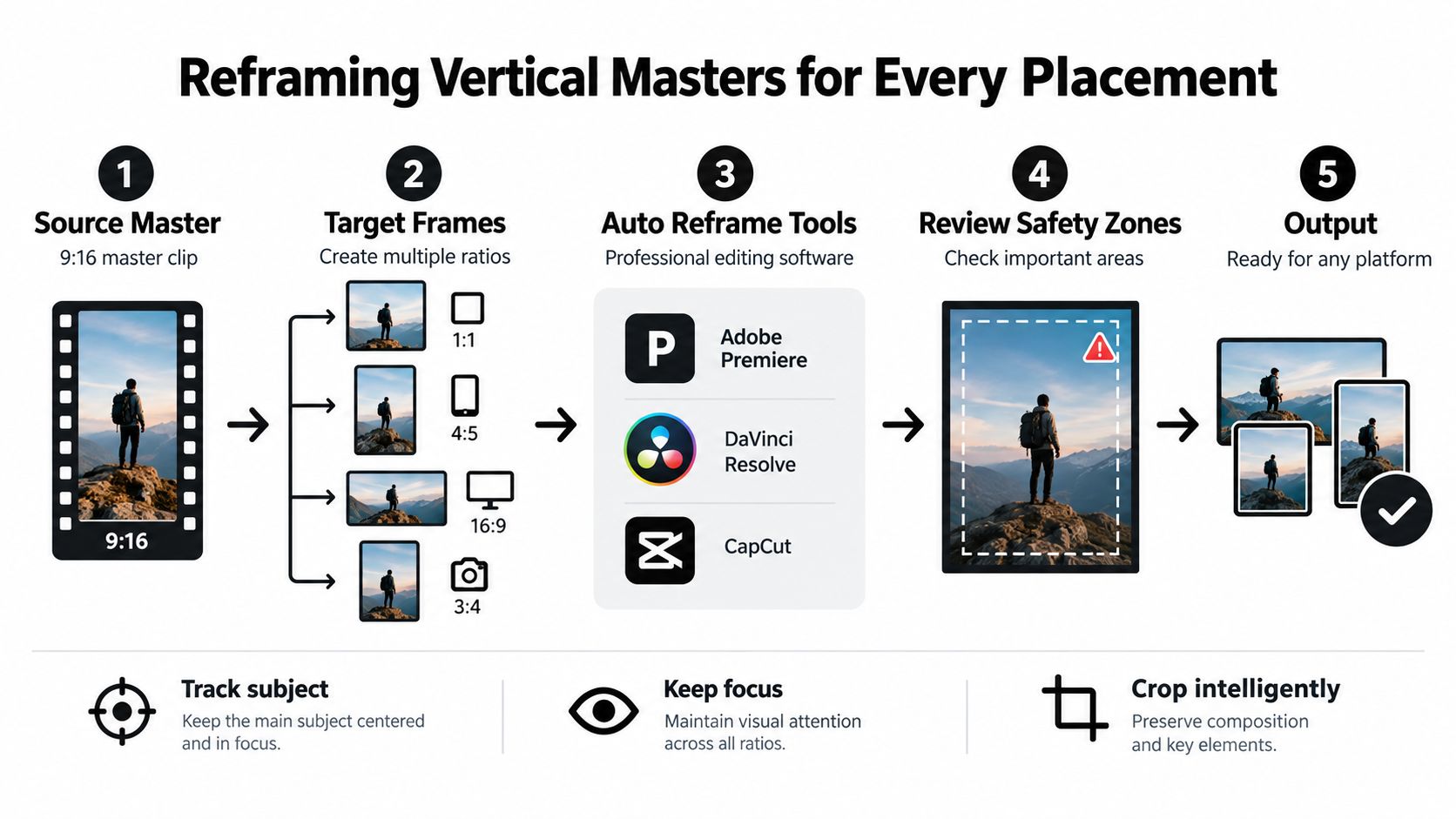
The cleanest social workflow starts with one strong vertical master, then spins out variants without rebuilding the whole cut. That's how teams keep approvals sane and still cover Reels, feed posts, Shorts, LinkedIn, and website embeds.
What automation gets right
Premiere Pro's Auto Reframe, DaVinci Resolve's Smart Reframe, and CapCut's auto-reframe tools all do a decent job when the subject is obvious and the movement is clean. Talking-head content, product demos, and simple walk-and-talk shots usually adapt well from 9:16 into 1:1 or 4:5.
The value isn't just speed. It's consistency. If you've already approved pacing, subtitles, and callouts in the master cut, automated reframing lets you preserve most of that editorial work.
Here's a useful visual reference for the workflow in motion:
<iframe width="100%" style="aspect-ratio: 16 / 9;" src="https://www.youtube.com/embed/XDTAeyhPL_U" frameborder="0" allow="autoplay; encrypted-media" allowfullscreen></iframe>
Where manual keyframes still win
Automation falls apart on motion-heavy scenes, multi-person compositions, and clips where text competes with the subject for center frame. In those cases, manual cropping is still faster than fixing a bad auto track ten times.
I use a few rules that keep cross-posting clean:
- Keep headline text central: If the title only works at the extreme top or bottom, it won't survive every placement.
- Design captions as blocks: Subtitle stacks should sit high enough to avoid UI and low enough not to cover faces.
- Protect the speaking subject: Don't let a crop chase motion so aggressively that it feels jittery.
A vertical master is only reusable if the important information lives near the center of the composition.
Final Cut Pro usually needs the most manual help here because the workflow relies more on layered positioning than on one-click social reframing. It still works. It just rewards careful review more than blind automation.
Cheat Sheet and Cross-Posting Tips
Specs are only useful if you can scan them fast while exporting. This is the version I'd keep next to the edit bay.
| Platform / Placement | Aspect Ratio | Dimensions (px) | Max Length | Max File Size | Recommended Codec |
|---|---|---|---|---|---|
| Instagram Reels | 9:16 | 1080 × 1920 | Up to 3 minutes | 4 GB | H.264 |
| Instagram Stories | 9:16 | 1080 × 1920 | Placement-dependent | 4 GB | H.264 |
| Instagram Feed Video | 4:5 | 1080 × 1350 | Placement-dependent | 4 GB | H.264 |
| Instagram Carousel Video | 4:5 | 1080 × 1350 | Placement-dependent | 4 GB | H.264 |
| TikTok In-feed | 9:16 | 1080 × 1920 preferred | Account and placement dependent | Platform-dependent | H.264 |
| YouTube Shorts | 9:16 | 1080 × 1920 | Up to 3 minutes | Platform-dependent | H.264 |
| Standard YouTube | 16:9 | 1920 × 1080 and above | Up to 12 hours for eligible accounts | Up to 256 GB for eligible accounts | H.264 |
| Facebook Reels | 9:16 | 1080 × 1920 | Short-form placement dependent | Commonly guide-limited in social workflows | H.264 |
| LinkedIn Video | Vertical master often works well | 1080 × 1920 commonly used | Longer native posts supported | Varies by upload flow | H.264 |
Cross-posting without making every platform look cloned
The biggest mistake in cross-posting isn't the aspect ratio. It's laziness in packaging. Same caption, same line breaks, same hashtag stack, same cover frame. People notice.
A few habits keep reused creative from feeling recycled:
- Rewrite the caption per platform: TikTok can handle a looser voice. LinkedIn usually needs a cleaner opening line and clearer business framing.
- Swap cover frames deliberately: The best first frame for Reels often isn't the best preview image for LinkedIn or YouTube.
- Trim for behavior, not ego: A cut that breathes nicely on YouTube Shorts may still feel late on TikTok.
- Test reframes on underperformers: If a post misses, changing the crop and text position is often cheaper than producing a new concept from scratch.
What actually ships well
If a team asks me for one answer to social media video sizes, it's this: build a 9:16 master first, export H.264 MP4s, keep text inside conservative safe zones, and only branch into other ratios when the placement needs it.
That approach fits how people watch now. They're in vertical feeds, on phones, deciding quickly.
If you're generating social clips from prompts or static images, Veo3 AI gives you a practical way to produce source footage for the formats covered here, then adapt it into platform-ready exports. It's especially useful when you need a fast vertical master for Reels, TikTok, or Shorts and want one creation workflow that can feed multiple placements.
Related Articles
Continue with more blog posts in the same locale.

How to Replace a Face in a Photo Without Photoshop Skills
Learn how to replace a face in a photo with Photoshop, free tools, mobile apps and AI. Get blending tips, ethical checks and export ideas.
Read article
How to Make Anime Movies from Idea to Release
Learn how to make anime movies from concept to distribution with AI workflows, Veo3 prompts, and pro pipeline tips for indie creators.
Read article
Best Time to Upload Video on YouTube: A Data-Driven Guide
Discover the best time to upload video on YouTube. Learn how to read analytics, run timing experiments, and schedule uploads for maximum reach.
Read article